Plotting estimated marginal means with tinyplot
Source:vignettes/plotting_tinyplot.Rmd
plotting_tinyplot.RmdThis vignette provides a quick overview with different examples that
show how to plot estimated marginal means, like in
this vignette, however, here we use the {tinyplot}
package instead of ggplot2 to create the plots.
Note: The x-axis automatically adjusts its limits when categorical predictors are used (by setting
xlimtoc(0.5, n + 0.5), the geoms are moved closer together, resulting in a more compact appearance). If appearance is too compact, specify different values forxlim, for instance,xlim = c(1, n)(wherenis the number of unique categories).
Note: When
facets are used, it might be useful to remove dodging, to harmonize the position of geoms across facets. To do so, setdodge = 0.
One predictor - categorical
The simplest case is possibly plotting one categorical predictor. Predicted values for each level and its confidence intervals are shown.
library(modelbased)
library(tinyplot)
tinytheme("classic", palette.qualitative = "Tableau 10")

data(efc, package = "modelbased")
efc <- datawizard::to_factor(efc, c("e16sex", "c172code", "e42dep"))

m <- lm(neg_c_7 ~ e16sex + c172code + barthtot, data = efc)
estimate_means(m, "c172code") |> plt()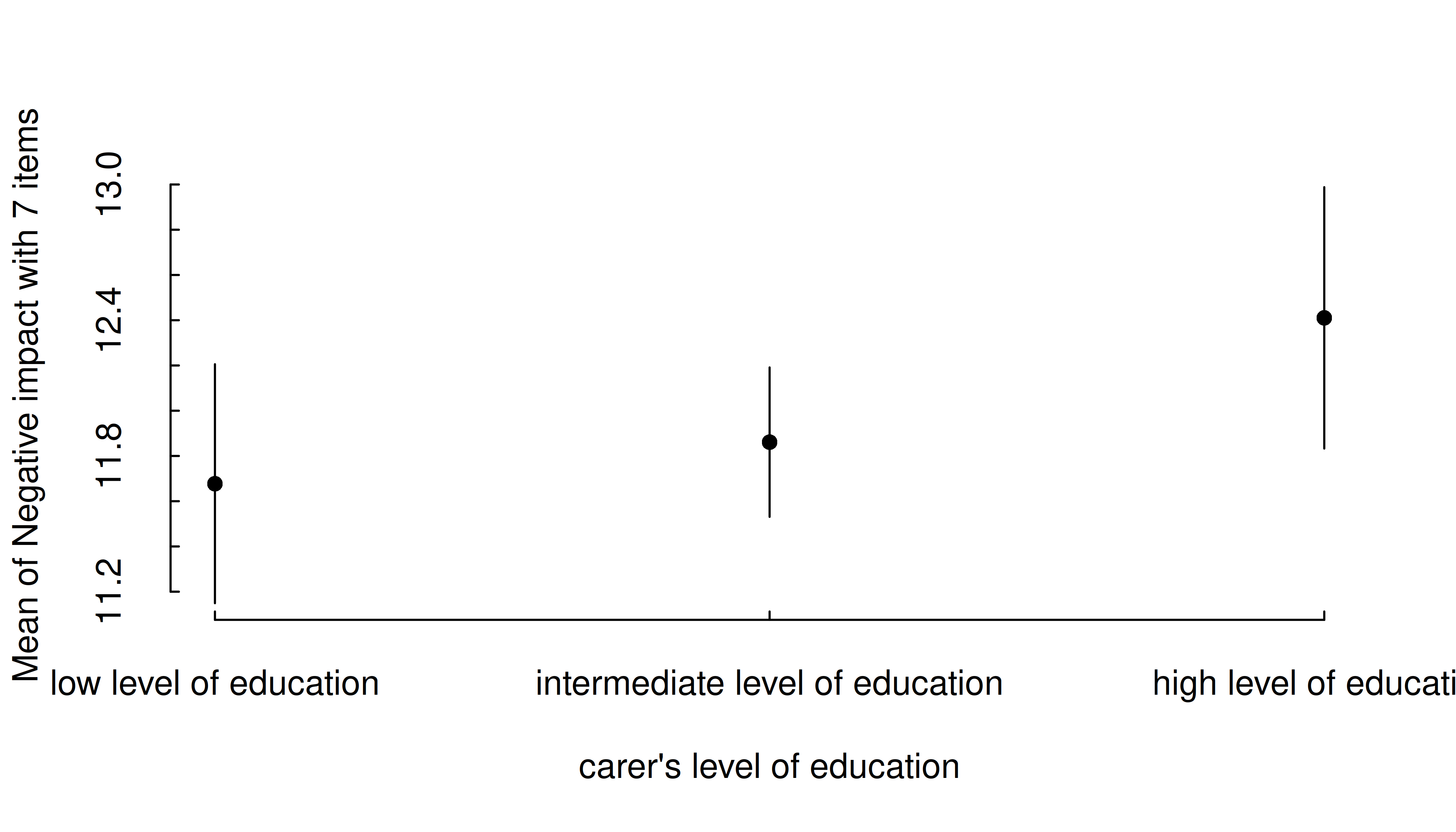
In general, plots can be further modified using functions or arguments from the tinyplot package.
estimate_means(m, "c172code") |>
  plt(type = "errorbar", flip = TRUE)
plt_add(type = "l", lty = 2)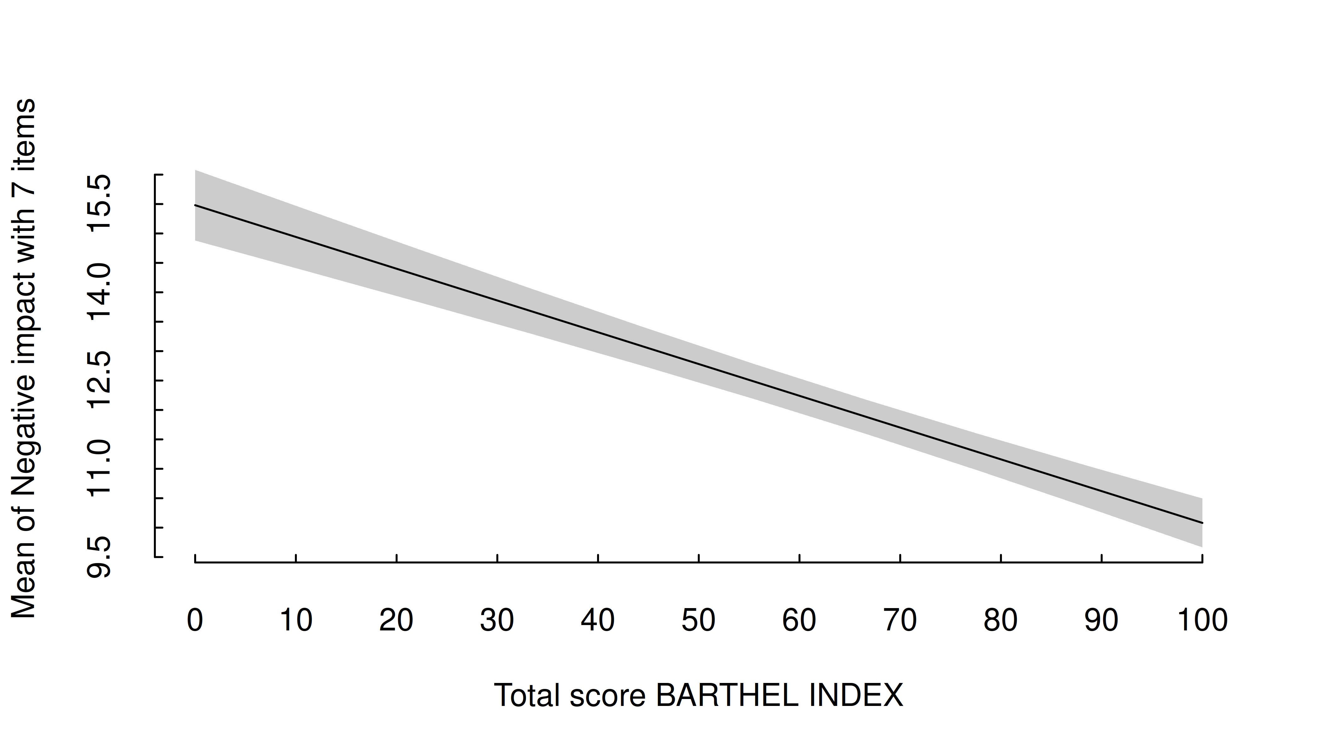
Pro-tip: You can pass a labeling function to wrap
long axis labels. Here we use one from the scales
package.
estimate_means(m, "c172code") |>
  plt(xaxl = scales::label_wrap(20), flip = TRUE)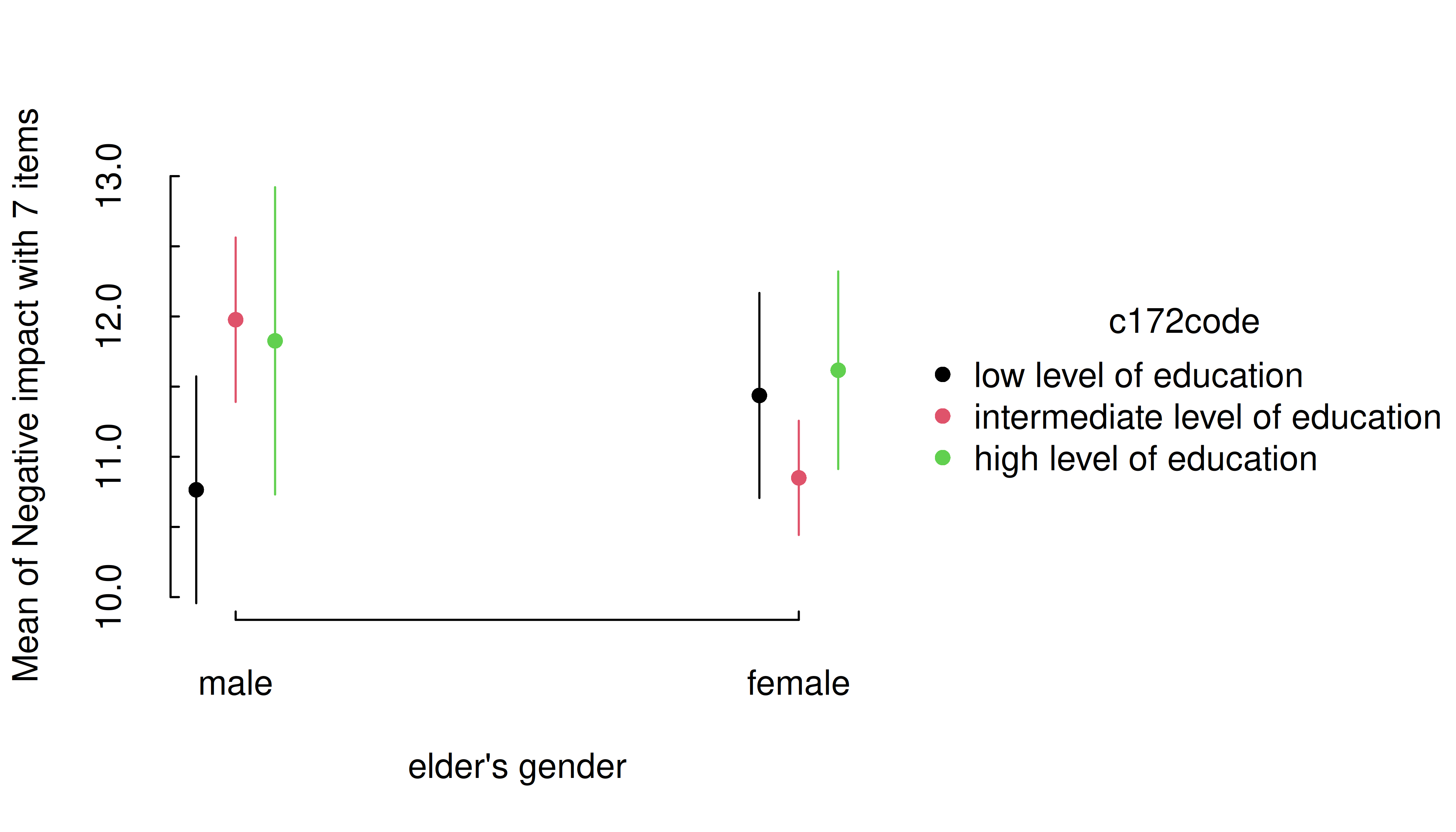
One predictor - numeric
For numeric predictors, the range of predictions at different values of the focal predictor are plotted, the uncertainty is displayed as confidence band.
estimate_means(m, "barthtot") |> plt()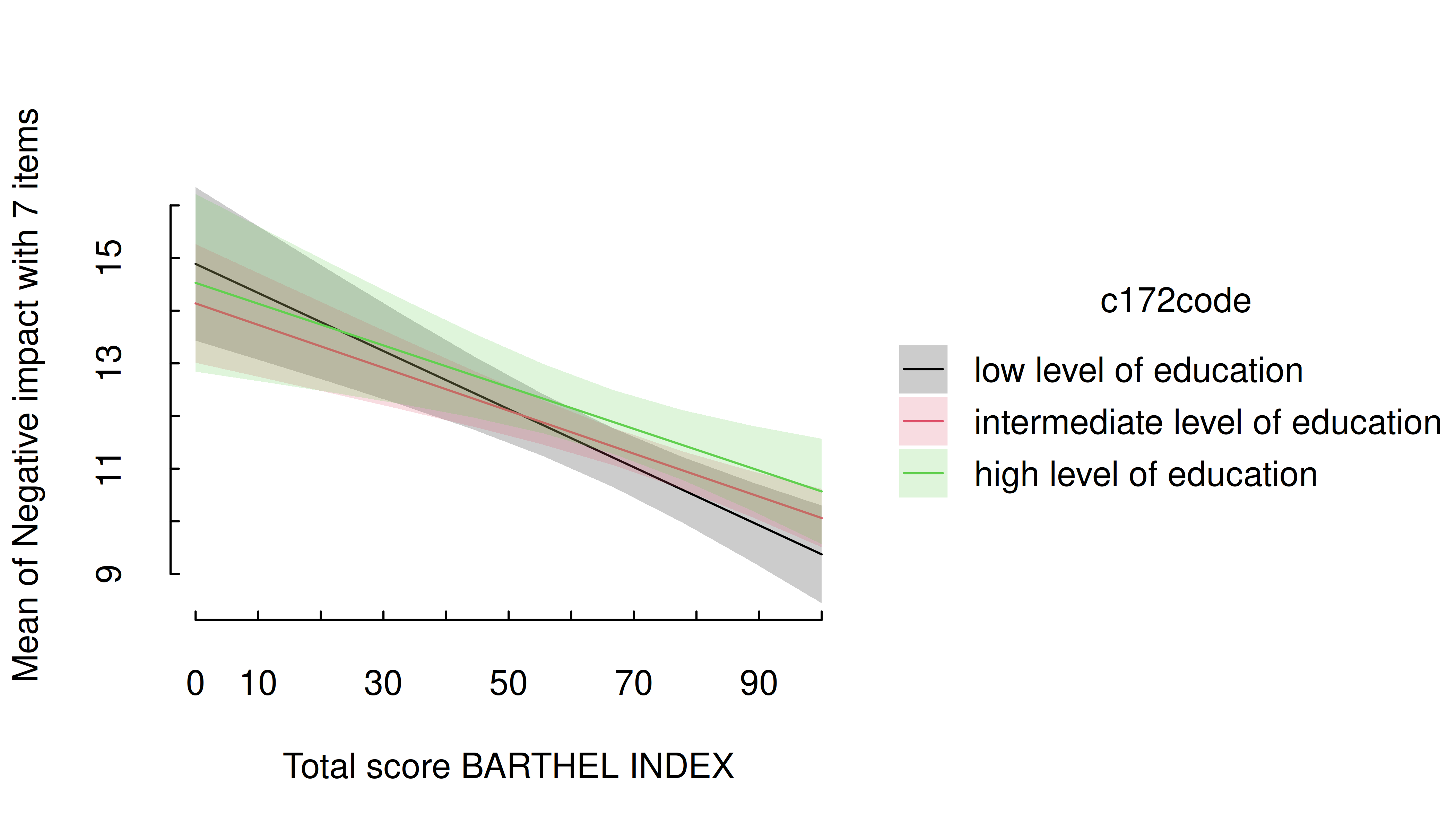
Two predictors - categorical
For two categorical predictors, the first focal predictors is plotted along the x-axis, while the levels of the second predictor are mapped to different colors.
m <- lm(neg_c_7 ~ e16sex * c172code + e42dep, data = efc)
estimate_means(m, c("e16sex", "c172code")) |> plt()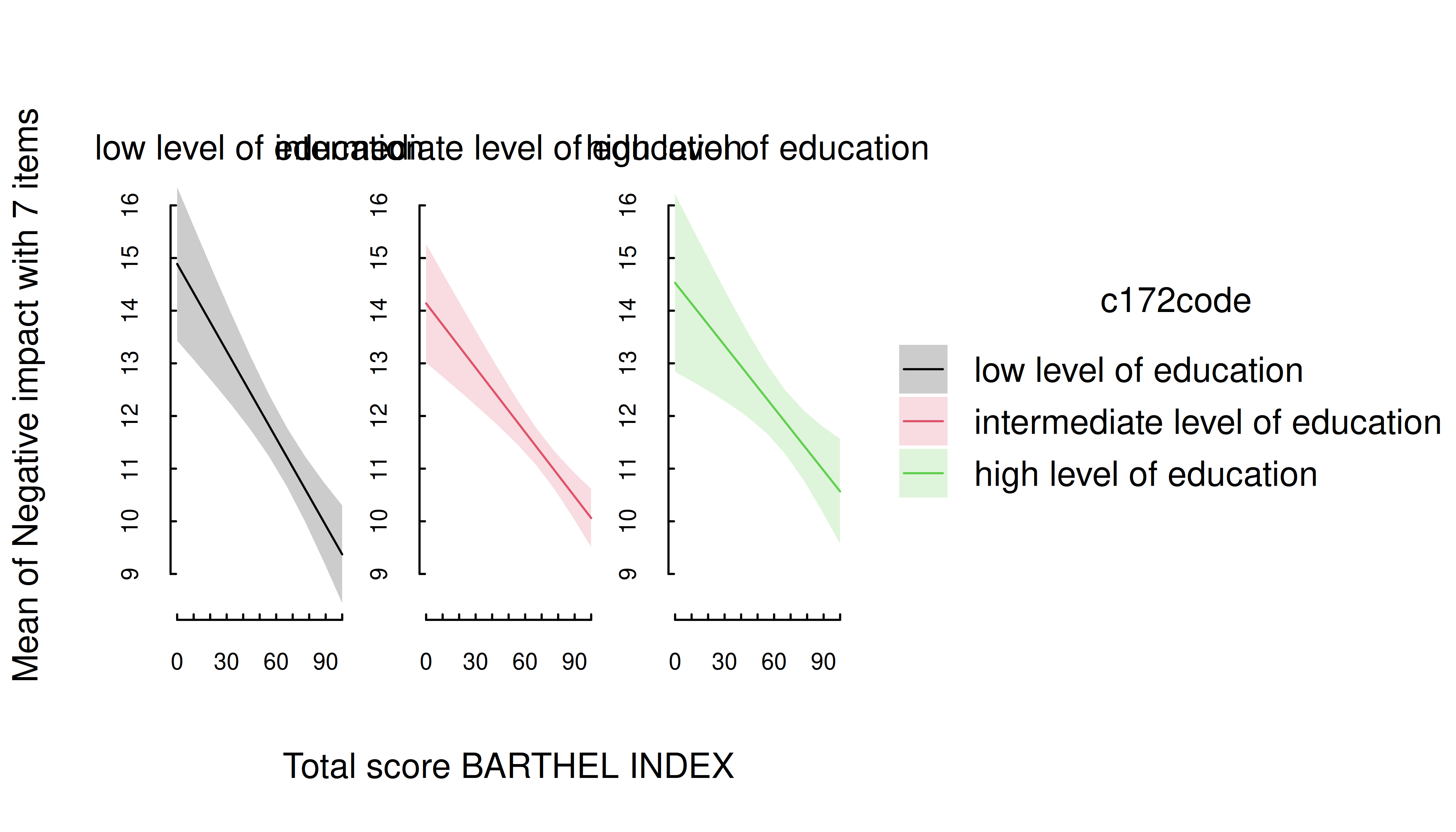
Again, you can layer on top of this plot using standard tinyplot functions and arguments.
estimate_means(m, c("e16sex", "c172code")) |> plt()
plt_add(type = "l", lty = 2)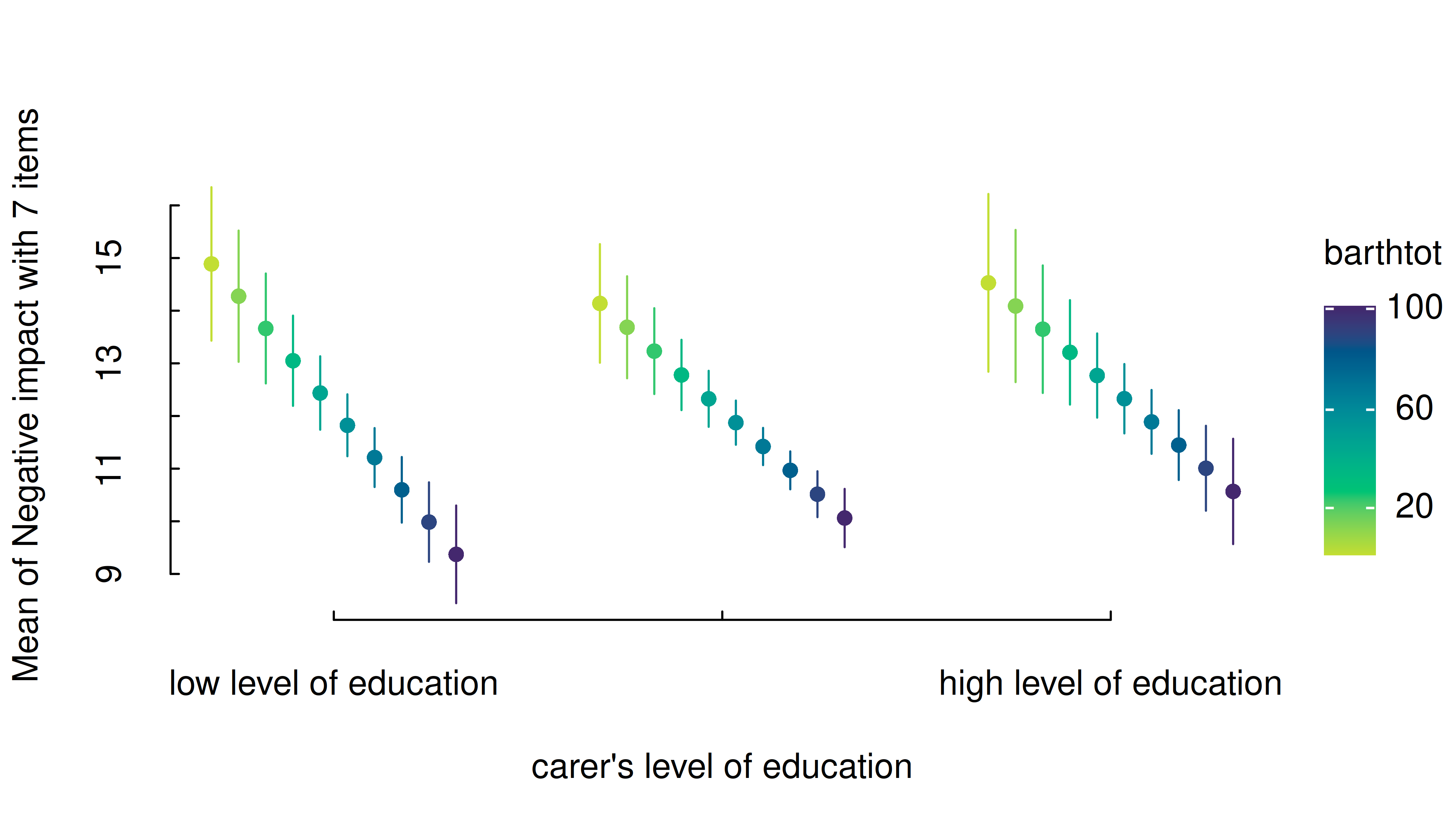
Two predictors - numeric * categorical
For two predictors, where the first is numeric and the second categorical, range of predictions including confidence bands are shown, with the different levels of the second (categorical) predictor mapped to colors again.
m <- lm(neg_c_7 ~ barthtot * c172code + e42dep, data = efc)
estimate_means(m, c("barthtot", "c172code")) |> plt()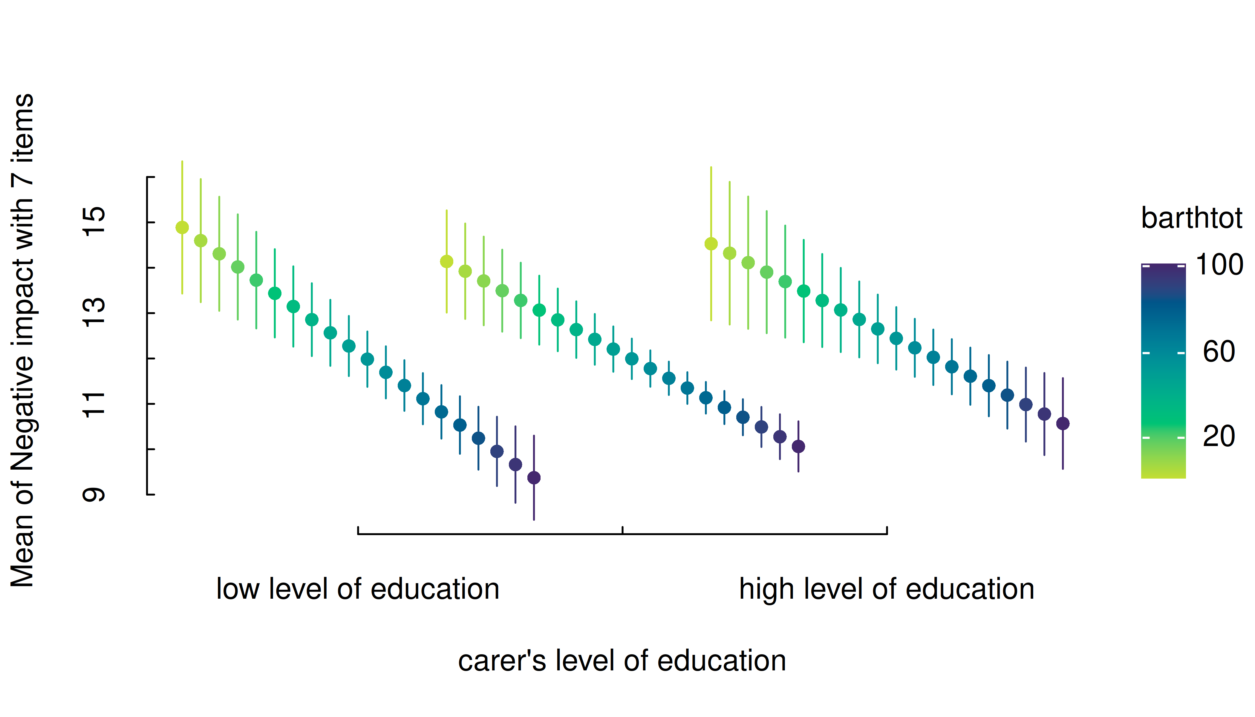
One potentially useful customization for these numeric * categorical cases is mapping predictive groups by facets (in addition to, or instead of colors). Below we make an additional tweak by wrapping the facet names, since these are rather long.
estimate_means(m, c("barthtot", "c172code")) |>
  within({
    c172code = gsub(" of education$", "\nof education", c172code)
  }) |>
  plt(facet = "by", legend = FALSE)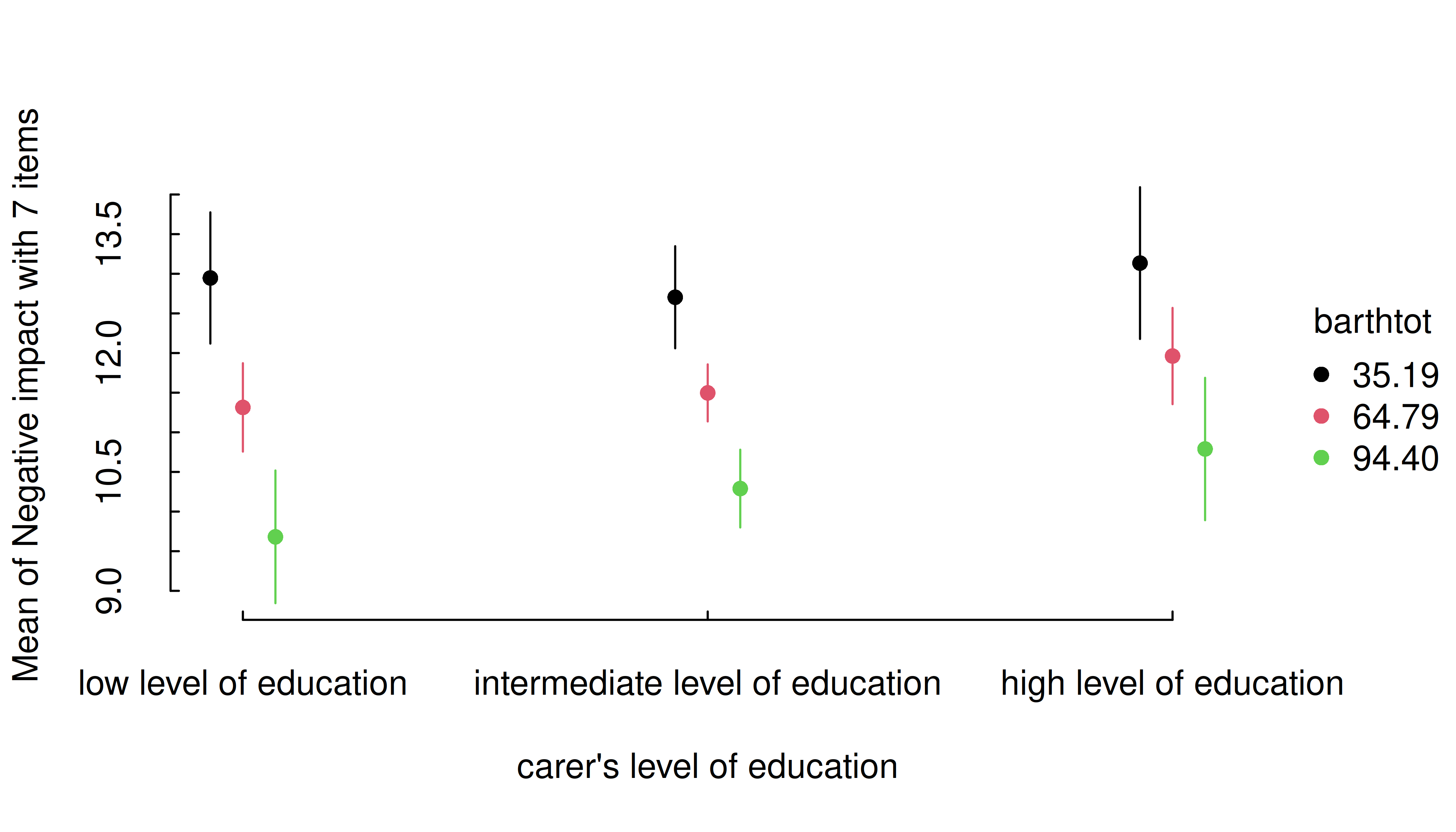
Two predictors - categorical * numeric
If the numeric predictor is the second focal term, its values are still mapped to colors, however, by default to a continuous (gradient) scale, because a range of representative values for that numeric predictor is used by default.
Focal predictors specified in estimate_means() are
passed to insight::get_datagrid(). If not specified
otherwise, representative values for numeric predictors are evenly
distributed from the minimum to the maximum, with a total number of
length values covering that range.
I.e., by default, arguments range = "range" and
length = 10 in insight::get_datagrid(), and
thus for numeric predictors, a range of length values
is used to estimate predictions.
# by default, `range = "range"` and `length = 10`
estimate_means(m, c("c172code", "barthtot")) |> plt()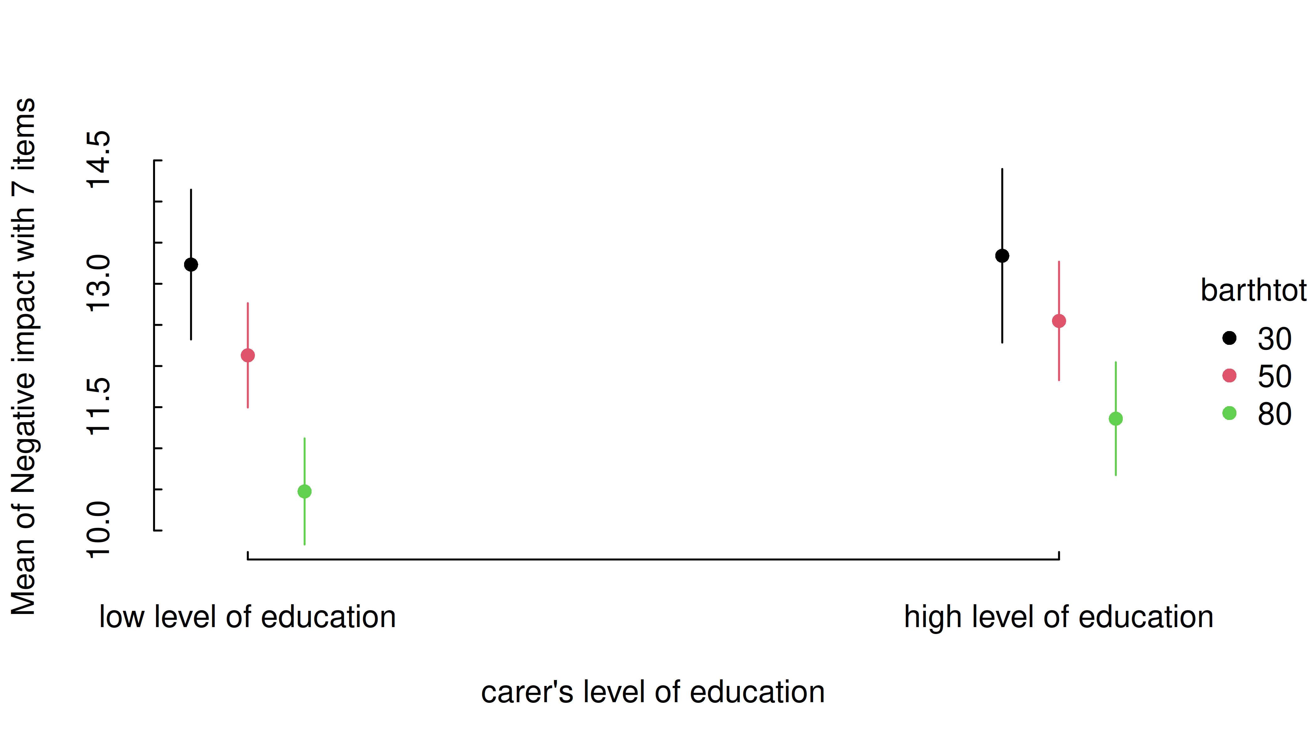
That means that the length argument can be used to
control how many values (lines) for the numeric predictors are
chosen.
estimate_means(m, c("c172code", "barthtot"), length = 20) |> plt()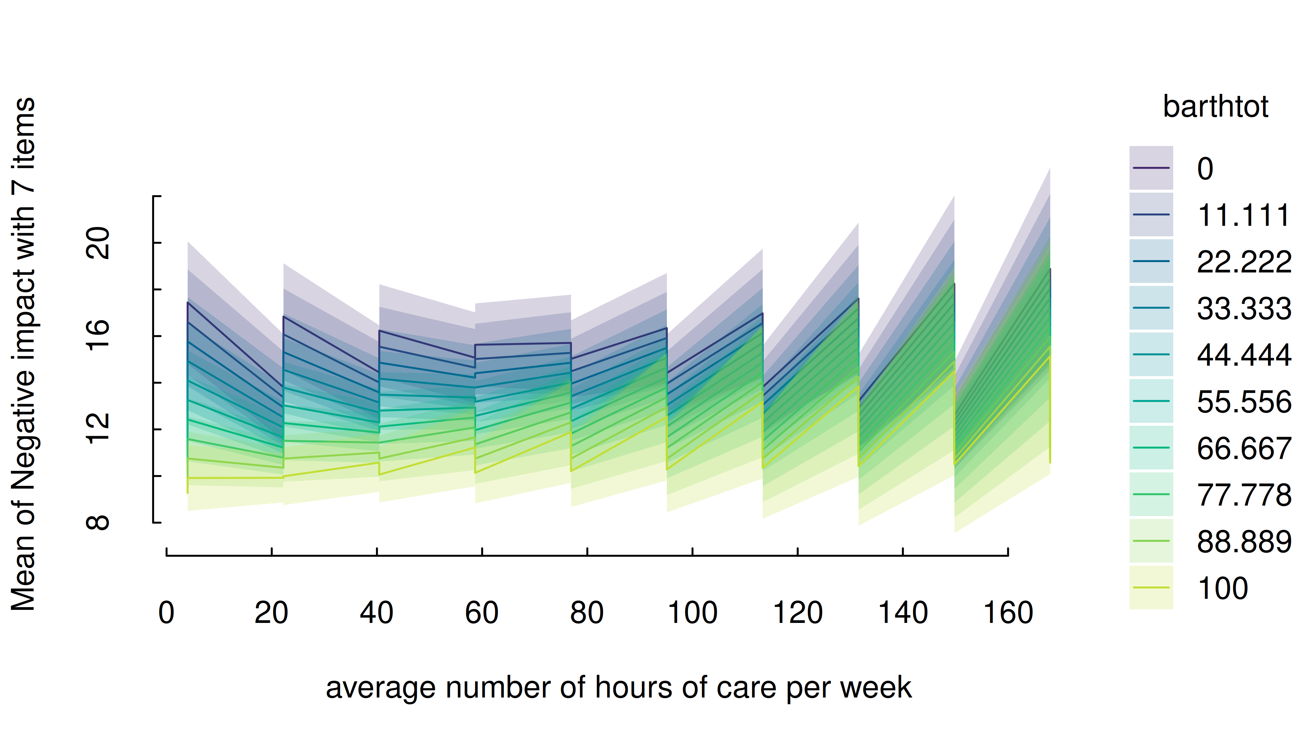
Another option would be to use range = "grid", in which
case the mean and +/- one standard deviation around the mean are chosen
as representative values for numeric predictors.
estimate_means(m, c("c172code", "barthtot"), range = "grid") |> plt()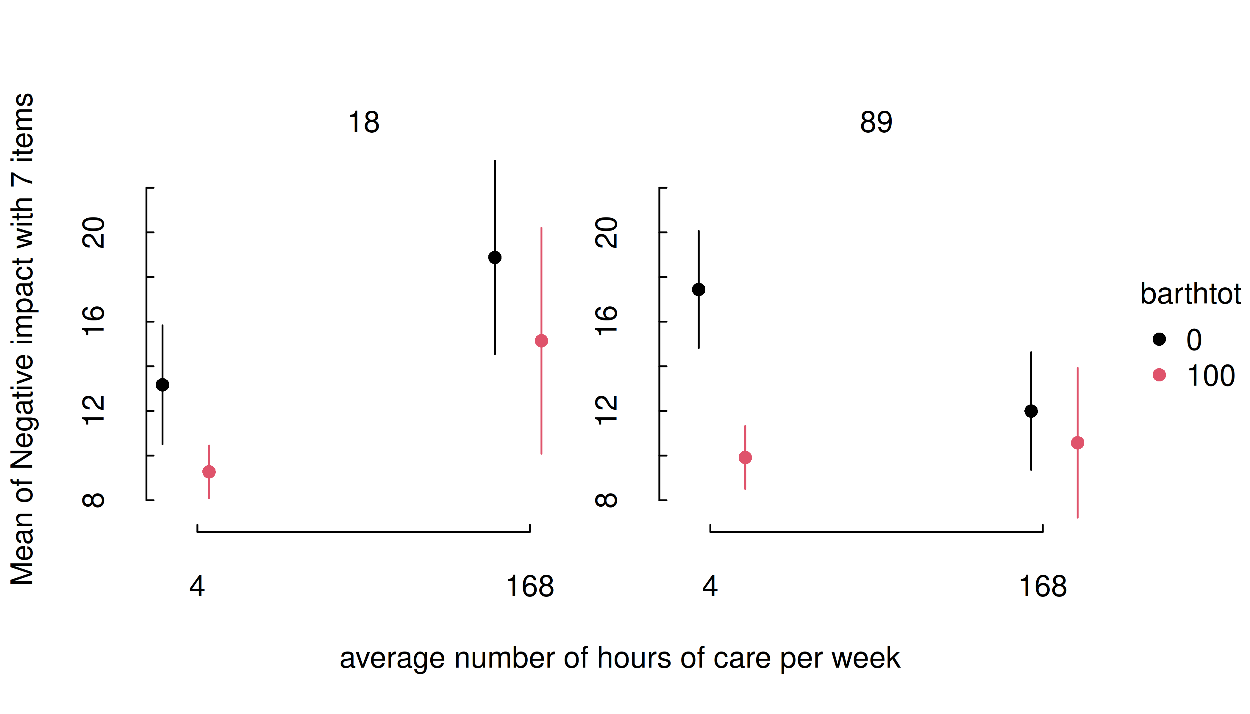
It is also possible to specify representative values, at which the
estimated marginal means of the outcome should be plotted. Again,
consult the documentation at ?insight::get_datagrid for
further details.
estimate_means(
  m,
  c(
    "c172code = c('low level of education', 'high level of education')",
    "barthtot = c(30, 50, 80)"
  )
) |> plt()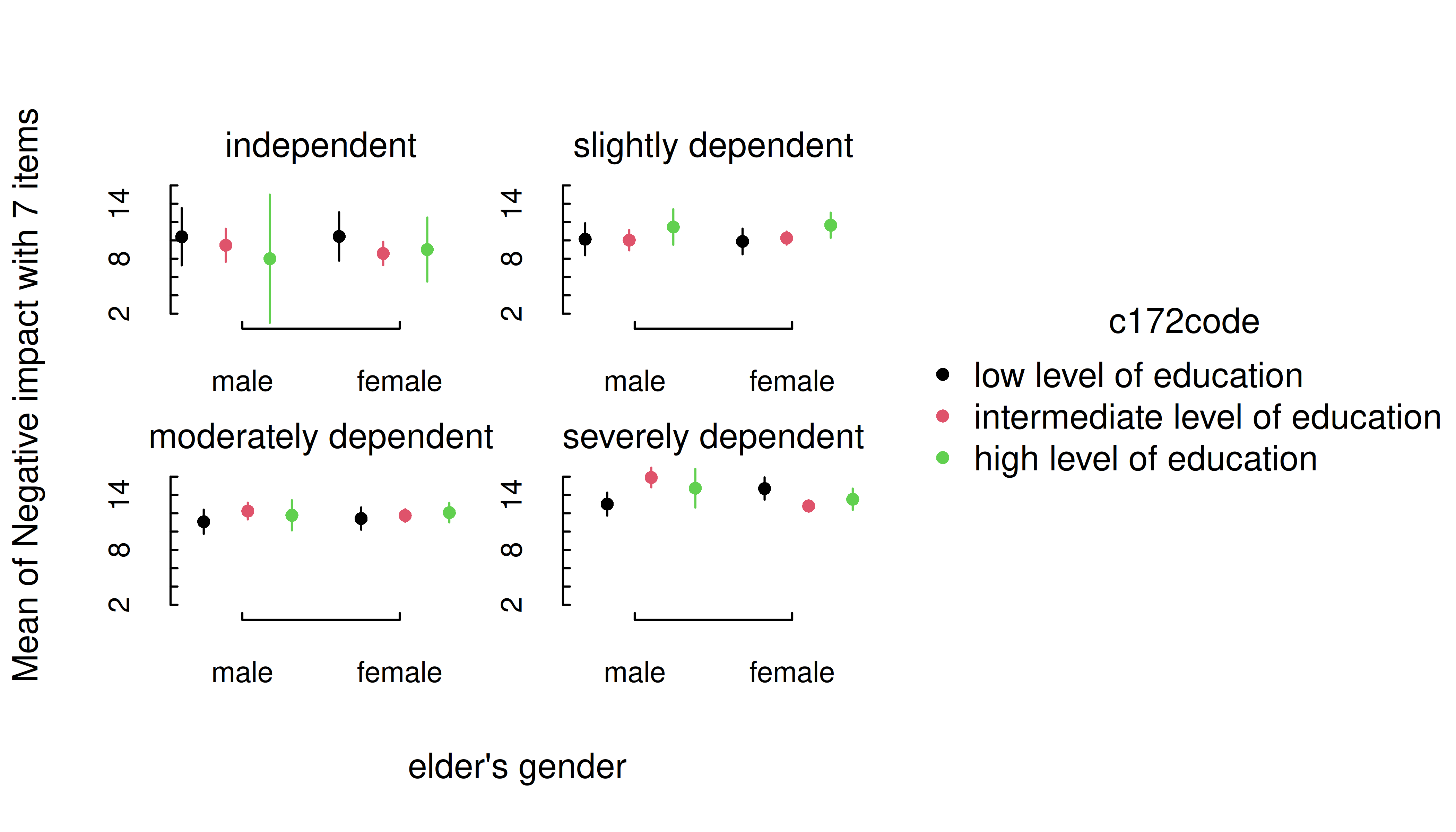
estimate_means(m, c("c172code", "barthtot = [fivenum]")) |> plt()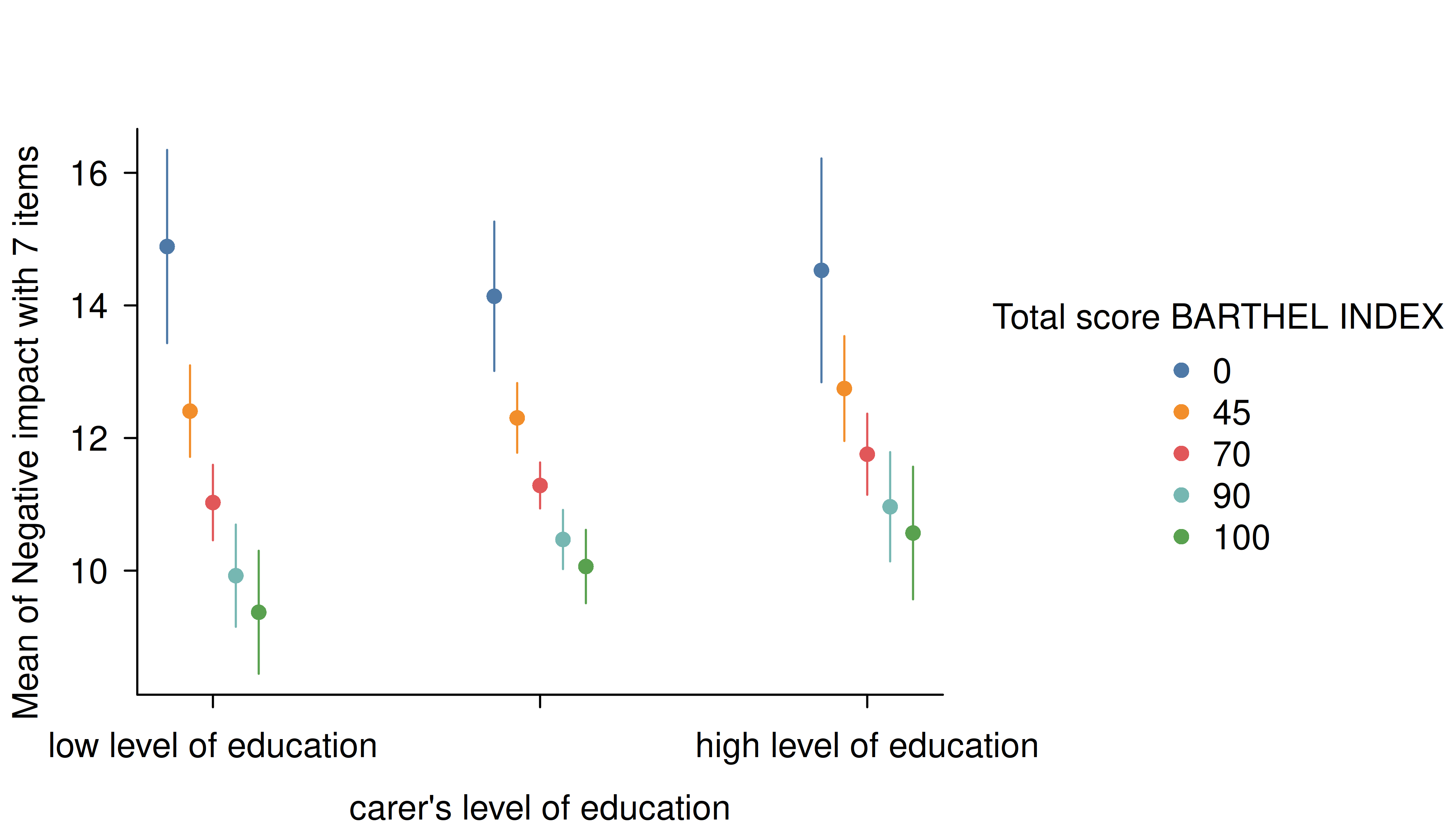
One aesthetic issue in the preceding plots is the fact that the
middle x-axis category is missing (hidden) due to space limitations.
Again, this is a common problem when we have several discrete categories
and long label strings. One option is to increase the horizontal spacing
by moving the legend (e.g., legend = bottom!). But a more
sure-fire way to ensure that all tick labels are printed is by using a
labelling function that wraps the text and/or flipping the plot.
estimate_means(m, c("c172code", "barthtot = [fivenum]")) |>
  plt(xaxl = scales::label_wrap(20), flip = TRUE)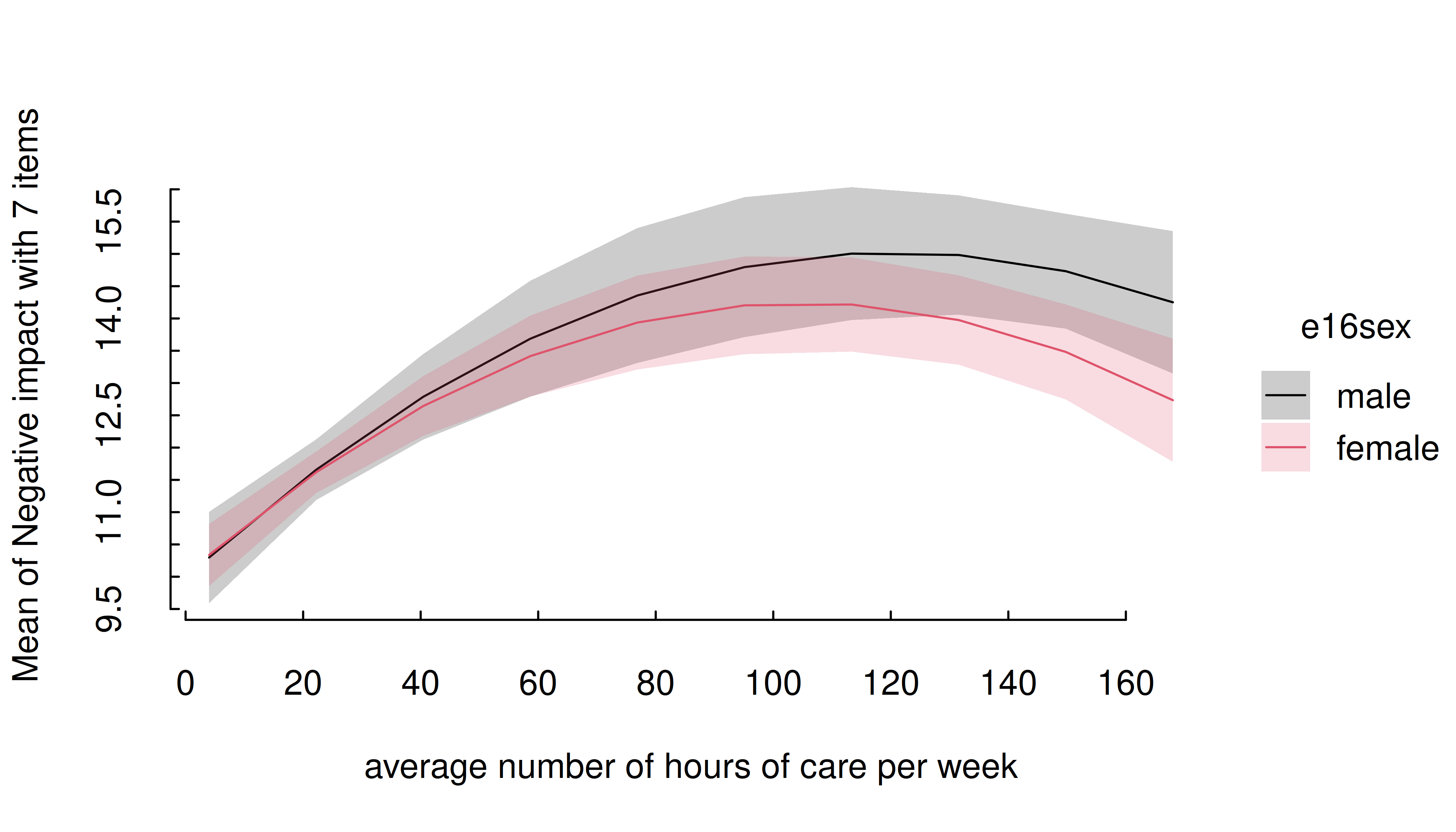
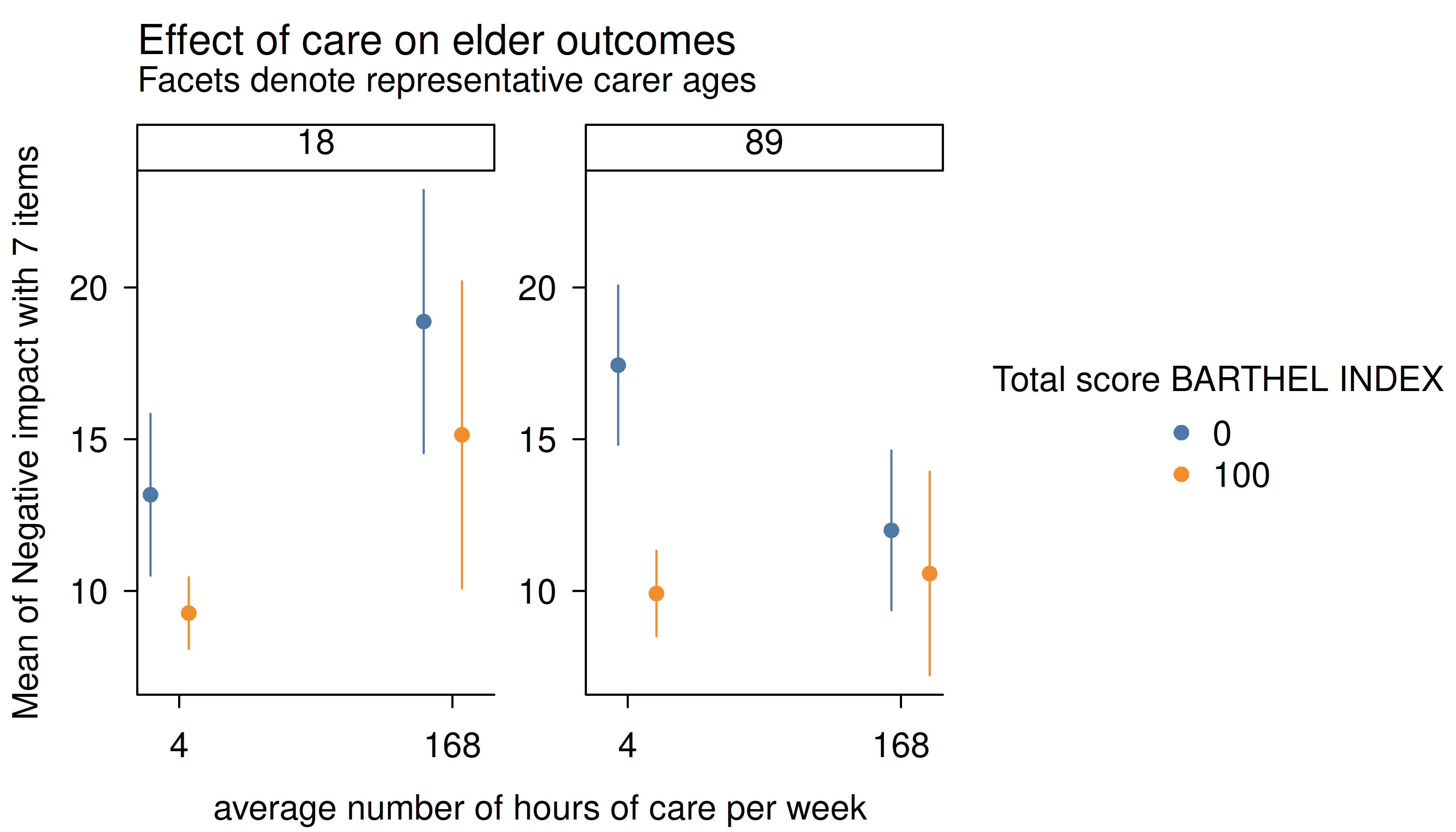
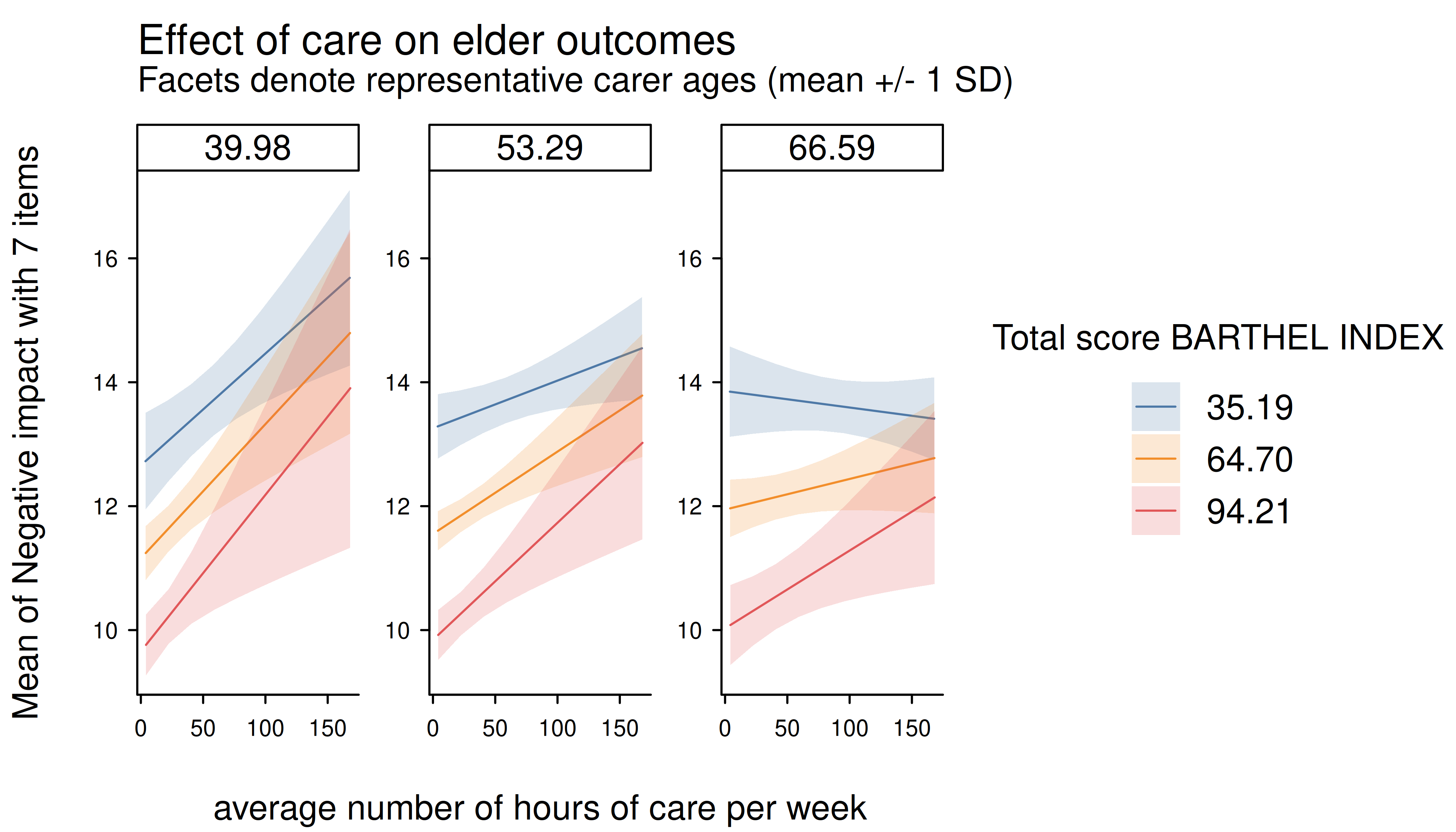
Three numeric predictors
The default plot-setting for three numeric predictors can be rather confusing.
m <- lm(neg_c_7 ~ c12hour * barthtot * c160age, data = efc)
estimate_means(m, c("c12hour", "barthtot", "c160age")) |> plt()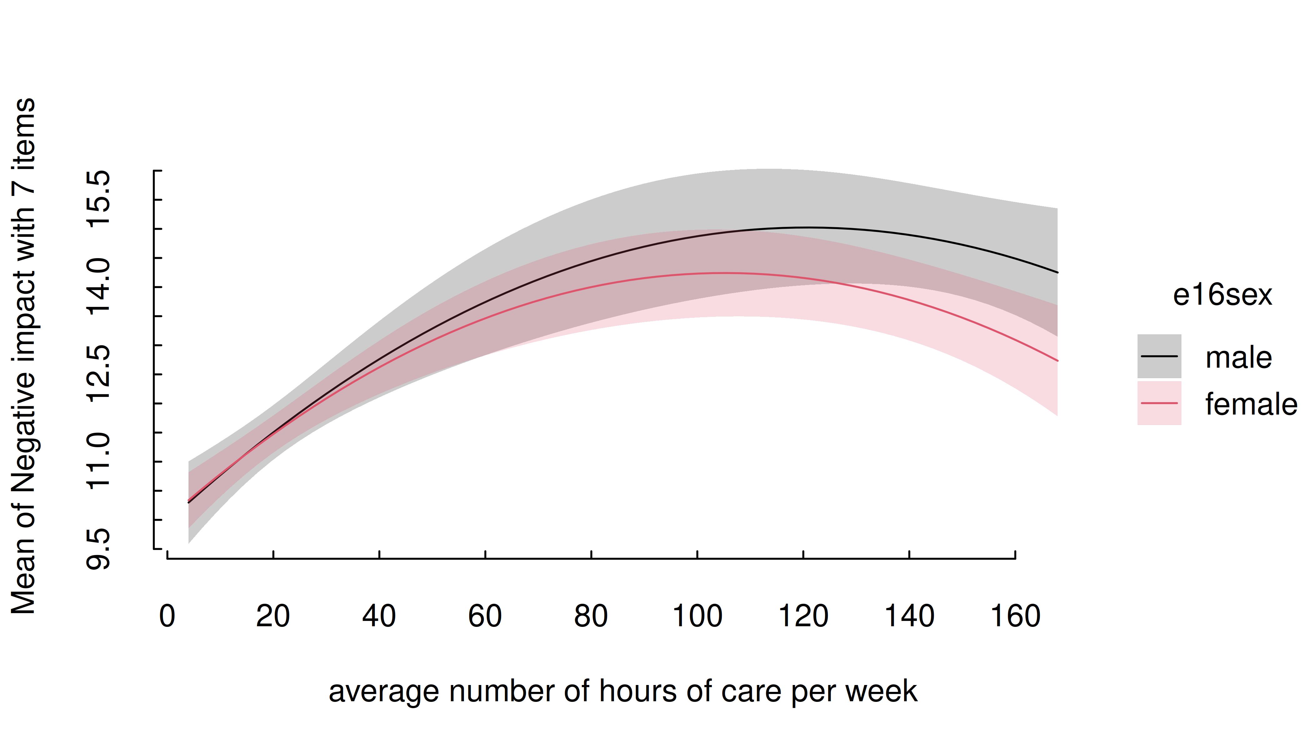
Instead, it is recommended to use length, create a
“reference grid”, or again specify meaningful values directly in the
by argument. Note that this will have the ancillary effect
of generating facets by the third variable (here: “cs160age”, i.e. carer
age).
estimate_means(m, c("c12hour", "barthtot", "c160age"), length = 2) |>
  plt(
    main = "Effect of care on elder outcomes",
    sub = "Facets denote representative carer ages"
  )
estimate_means(m, c("c12hour", "barthtot", "c160age"), range = "grid") |>
  plt(
    main = "Effect of care on elder outcomes",
    sub = "Facets denote representative carer ages (mean +/- 1 SD)"
  )
Three categorical predictors
Multiple categorical predictors are usually less problematic, since discrete color scales and faceting are used to distinguish between factor levels.
m <- lm(neg_c_7 ~ e16sex * c172code * e42dep, data = efc)
estimate_means(m, c("e16sex", "c172code", "e42dep")) |> plt()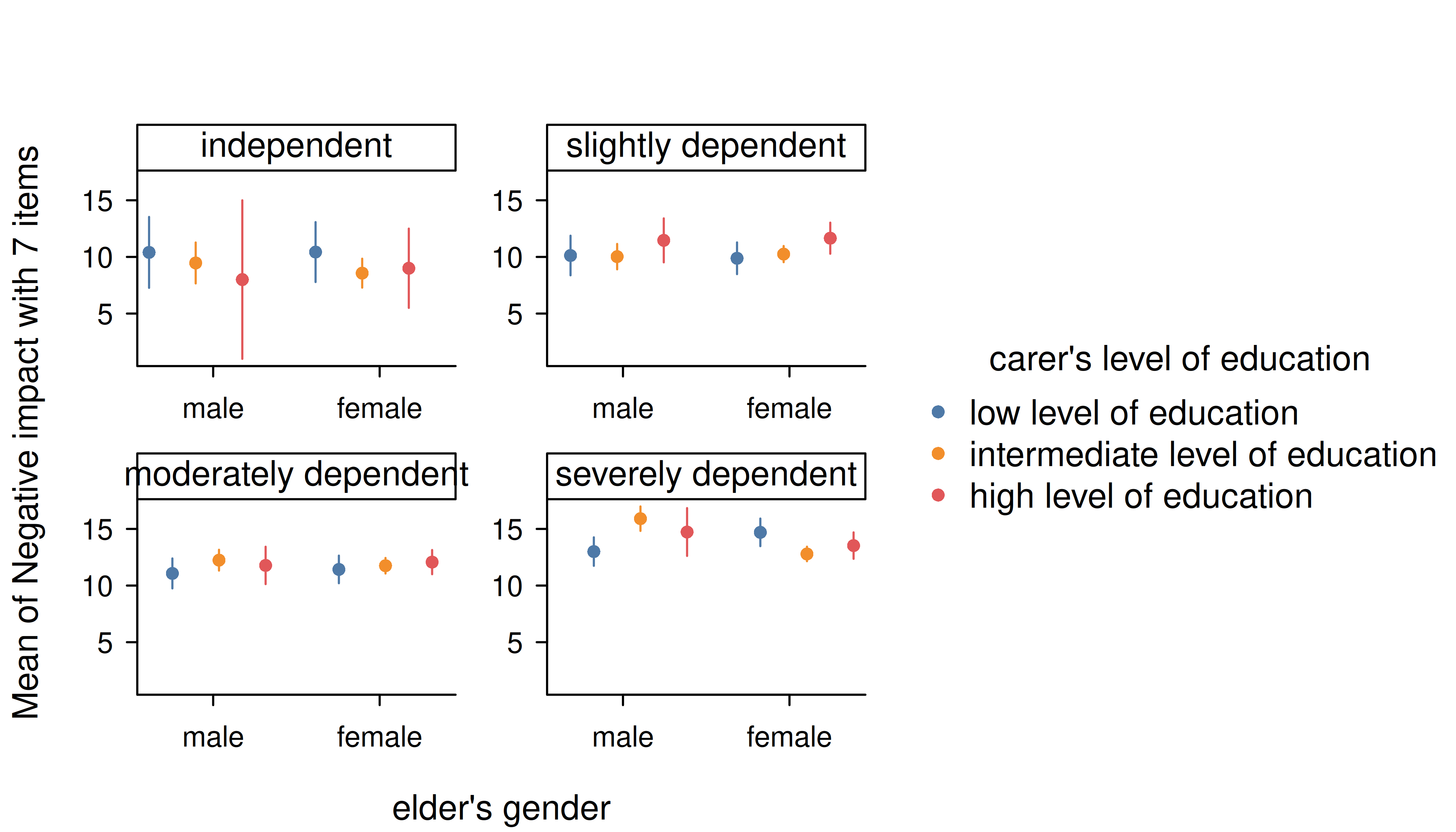
Again, though we can improve the final aesthetic with a few tweaks.
estimate_means(m, c("e16sex", "c172code", "e42dep")) |>
  plt(dodge = 0.02, theme = "clean2")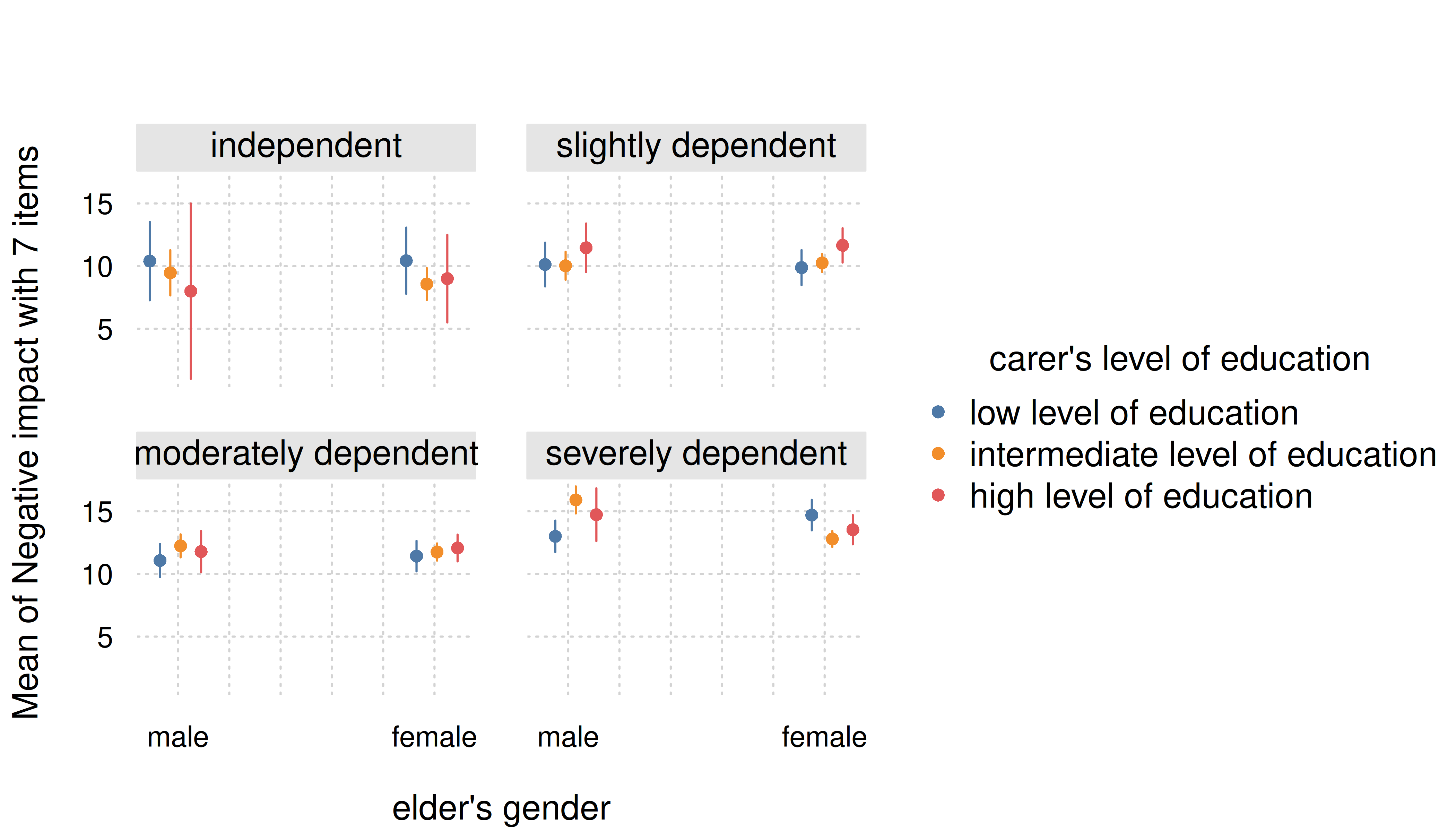
Smooth plots
Remember that by default a range of ten values is chosen for numeric focal predictors. While this mostly works well for plotting linear relationships, plots may look less smooth for certain models that involve quadratic or cubic terms, or splines, or for instance if you have GAMs.
tinytheme("classic", palette.qualitative = "Tableau 10")
m <- lm(neg_c_7 ~ e16sex * c12hour + e16sex * I(c12hour^2), data = efc)
estimate_means(m, c("c12hour", "e16sex")) |> plt()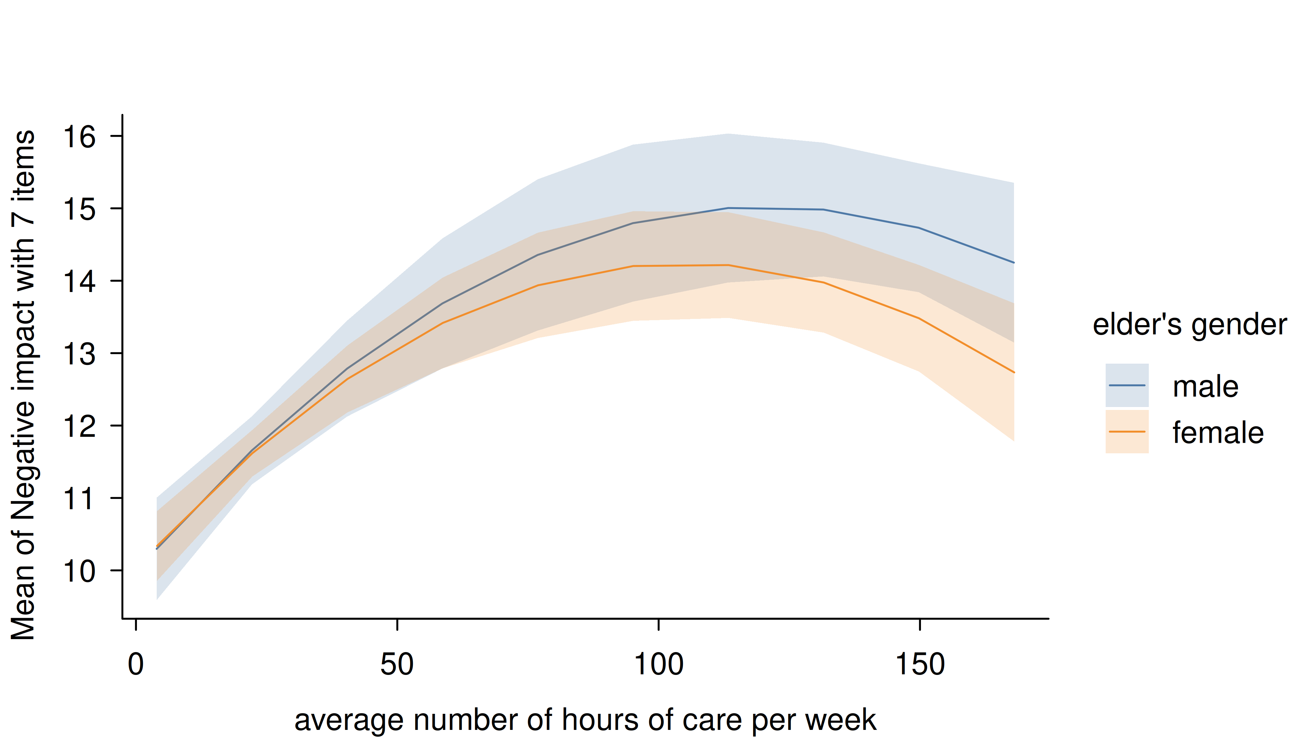
In this case, simply increase the number of representative values by
setting length to a higher number.
estimate_means(m, c("c12hour", "e16sex"), length = 200) |> plt()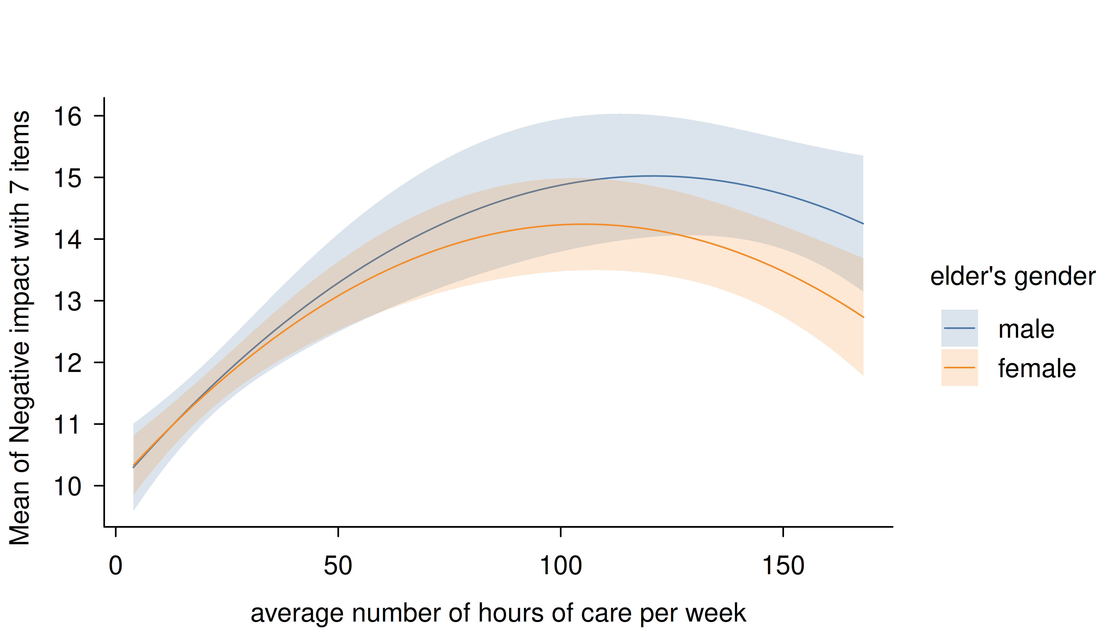
# reset theme
tinytheme()