This vignette provides a quick overview with different examples that show how to plot estimated marginal means.
In summary, you can use the length and
range arguments in estimate_means() (which are
passed to insight::get_datagrid()),
as well as directly specifying meaningful values in the by
argument, which are also used to create a data grid, to control the
plot-appearance. See also the vignette
on data grids.
Although the modelbased package does not focus on publication-ready plots, the default plots can already be used directly. Furthermore, a few modifications are already applies, like a percentage-scale for logistic regression models, or using variable labels for labelled data.
One predictor - categorical
The simplest case is possibly plotting one categorical predictor. Predicted values for each level and its confidence intervals are shown.
library(modelbased)
data(efc, package = "modelbased")
efc <- datawizard::to_factor(efc, c("e16sex", "c172code", "e42dep"))

m <- lm(neg_c_7 ~ e16sex + c172code + barthtot, data = efc)
estimate_means(m, "c172code") |> plot()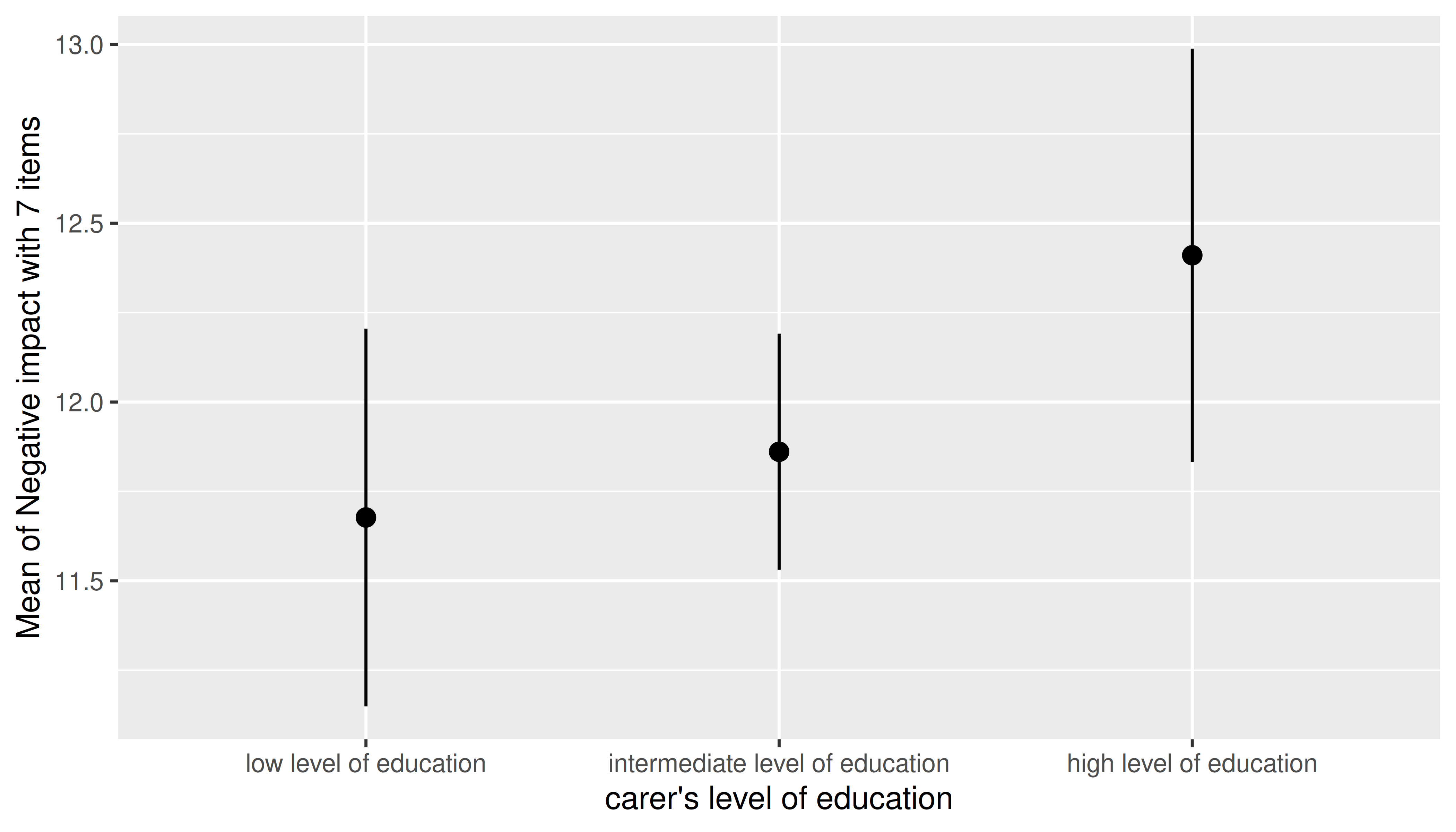
One predictor - numeric
For numeric predictors, the range of predictions at different values of the focal predictor are plotted, the uncertainty is displayed as confidence band.
estimate_means(m, "barthtot") |> plot()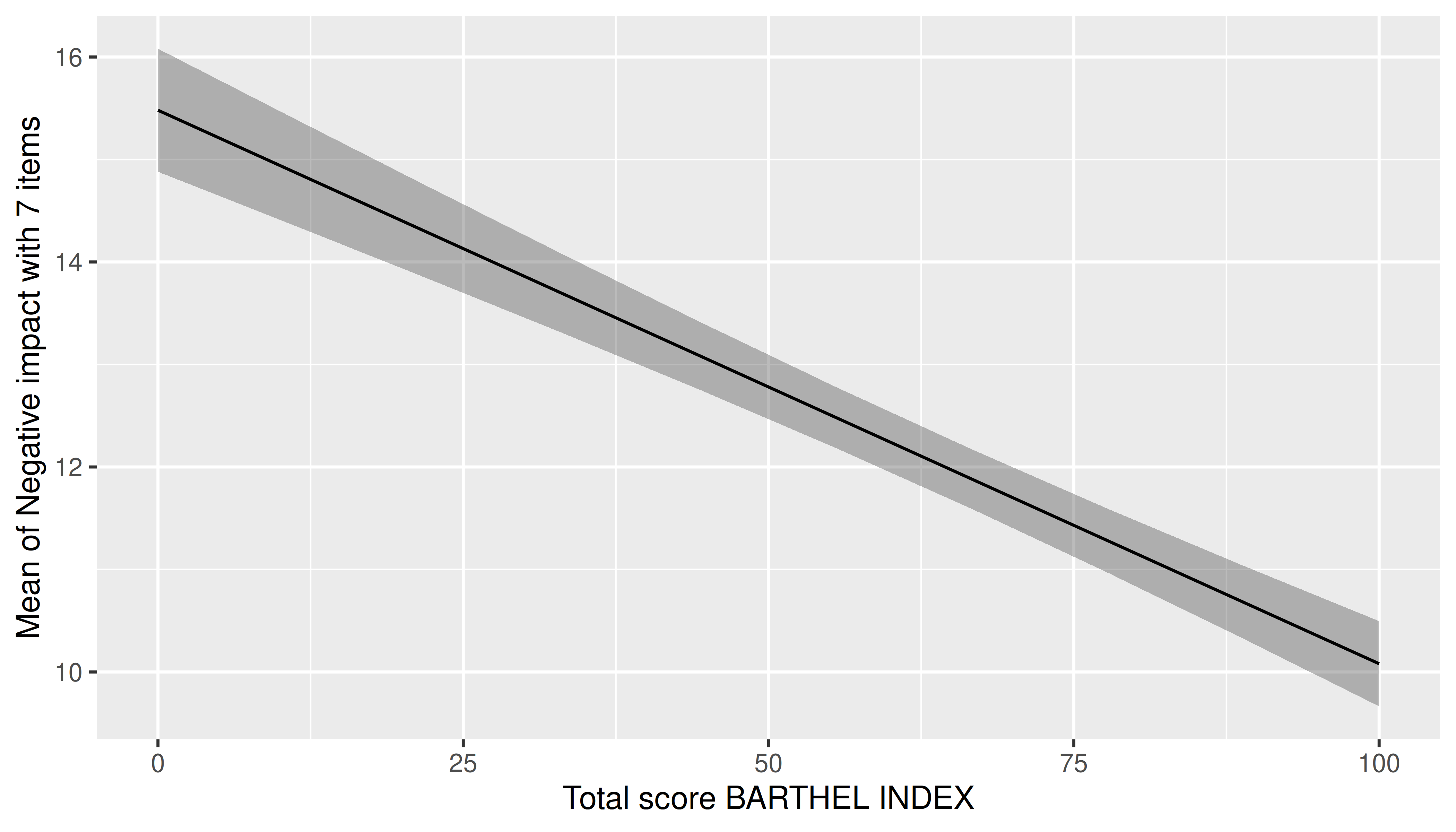
Two predictors - categorical
For two categorical predictors, the first focal predictors is plotted along the x-axis, while the levels of the second predictor are mapped to different colors.
m <- lm(neg_c_7 ~ e16sex * c172code + e42dep, data = efc)
estimate_means(m, c("e16sex", "c172code")) |> plot()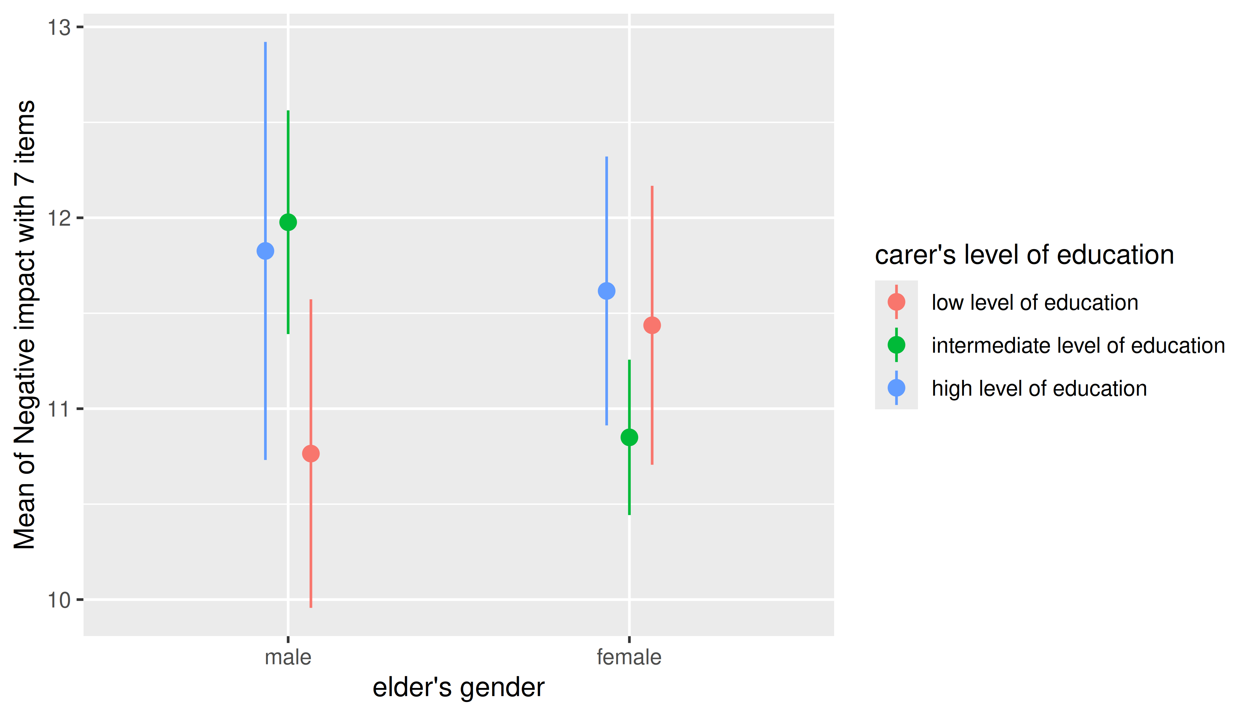
Two predictors - numeric * categorical
For two predictors, where the first is numeric and the second categorical, range of predictions including confidence bands are shown, with the different levels of the second (categorical) predictor mapped to colors again.
m <- lm(neg_c_7 ~ barthtot * c172code + e42dep, data = efc)
estimate_means(m, c("barthtot", "c172code")) |> plot()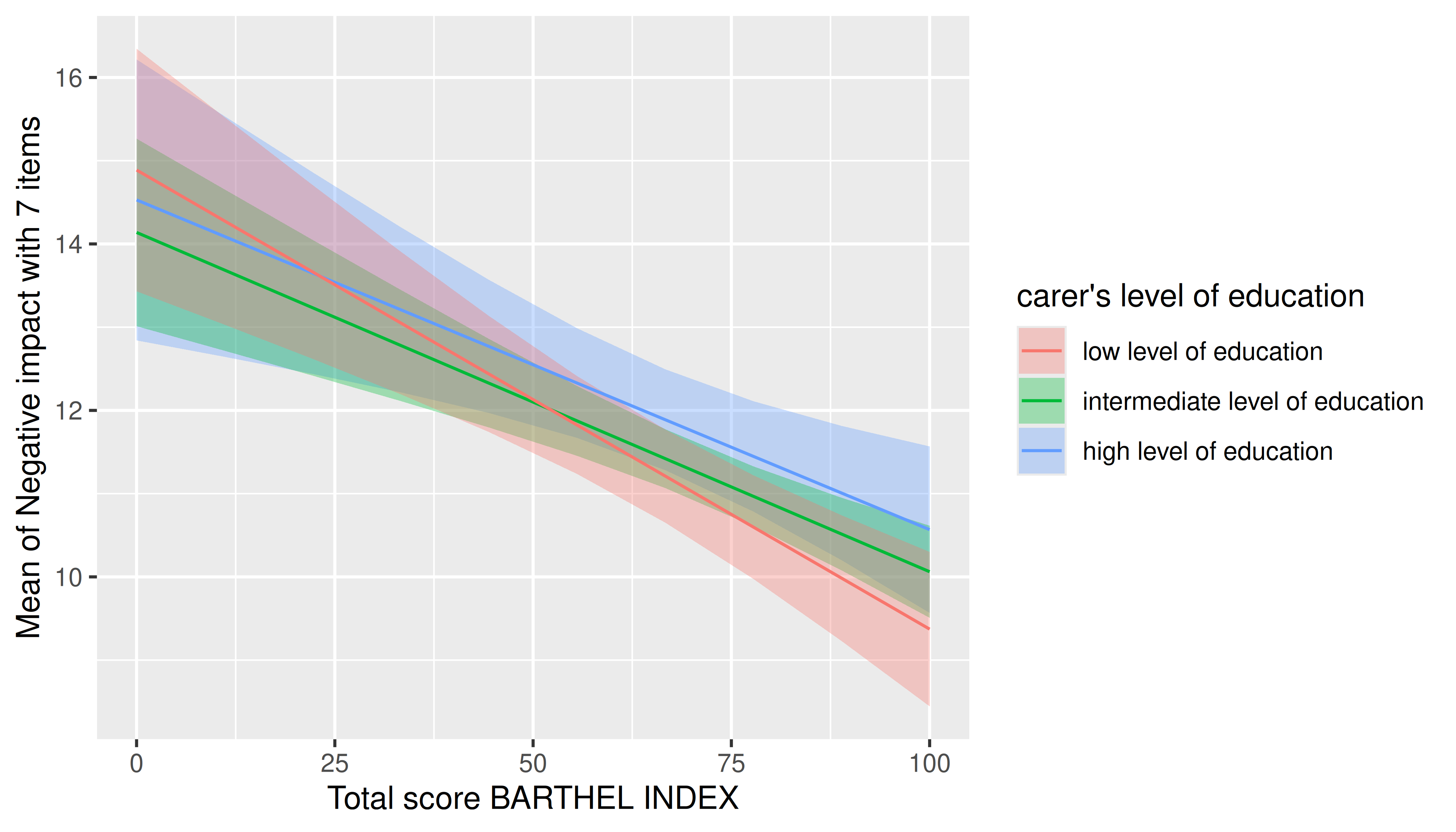
In general, plots can be further modified using functions from the ggplot2 package. Thereby, other themes, color scales, faceting and so on, can be applies.
library(ggplot2)
estimate_means(m, c("barthtot", "c172code")) |>
  plot() +
  see::theme_modern(show.ticks = TRUE)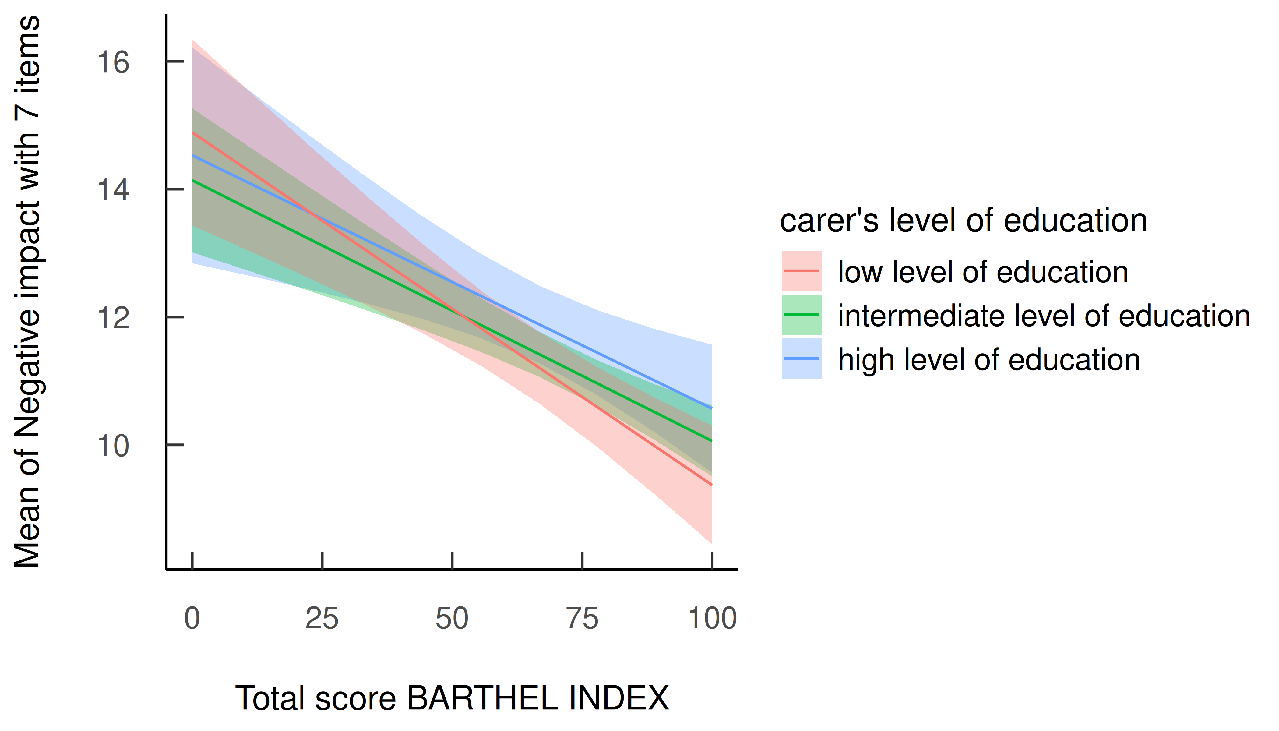
estimate_means(m, c("barthtot", "c172code")) |>
  plot() +
  facet_grid(~c172code)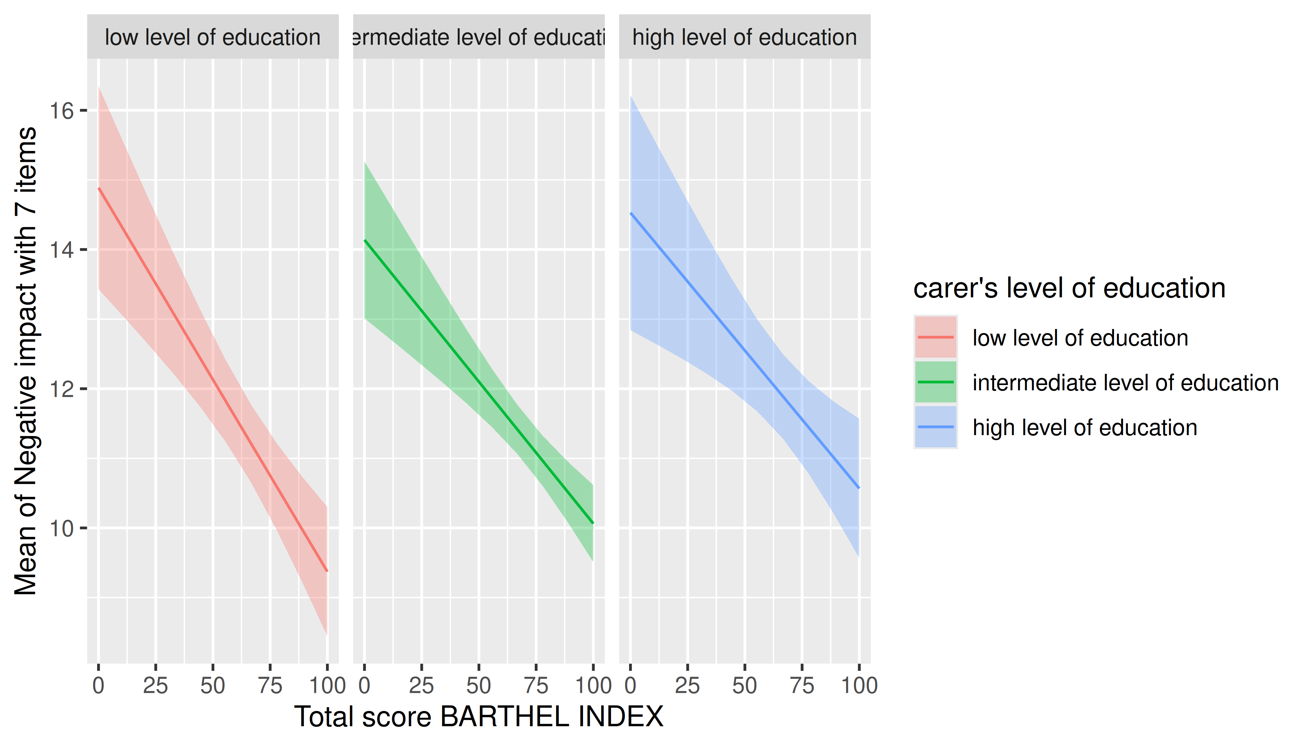
estimate_means(m, c("barthtot", "c172code")) |>
  plot() +
  scale_color_brewer(palette = "Dark2") +
  scale_fill_brewer(palette = "Dark2")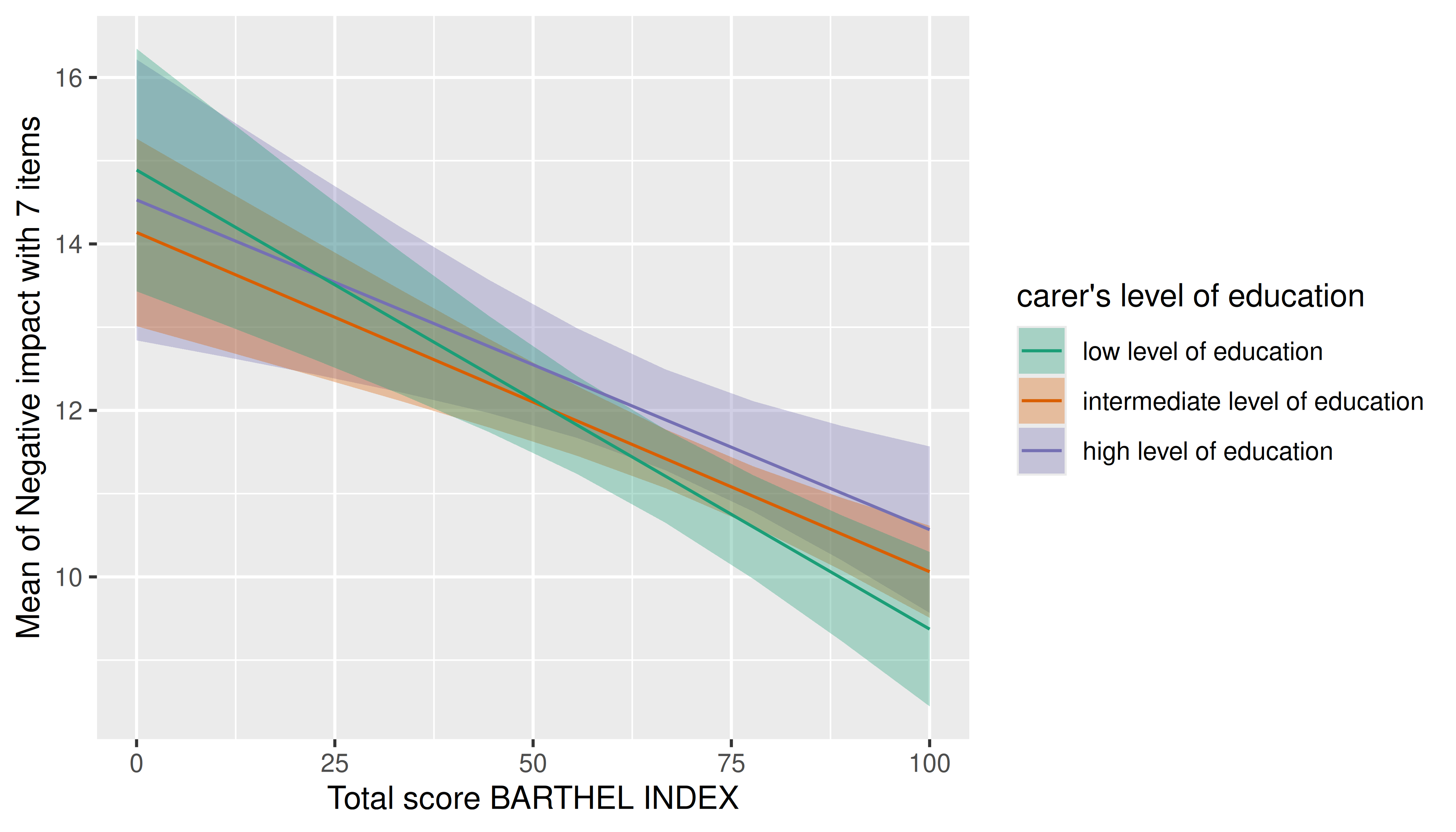
Two predictors - categorical * numeric
If the numeric predictor is the second focal term, its values are still mapped to colors, however, by default to a continuous (gradient) scale, because a range of representative values for that numeric predictor is used by default.
Focal predictors specified in estimate_means() are
passed to insight::get_datagrid(). If not specified
otherwise, representative values for numeric predictors are evenly
distributed from the minimum to the maximum, with a total number of
length values covering that range.
I.e., by default, arguments range = "range" and
length = 10 in insight::get_datagrid(), and
thus for numeric predictors, a range of length values
is used to estimate predictions.
# by default, `range = "range"` and `length = 10`
estimate_means(m, c("c172code", "barthtot")) |> plot()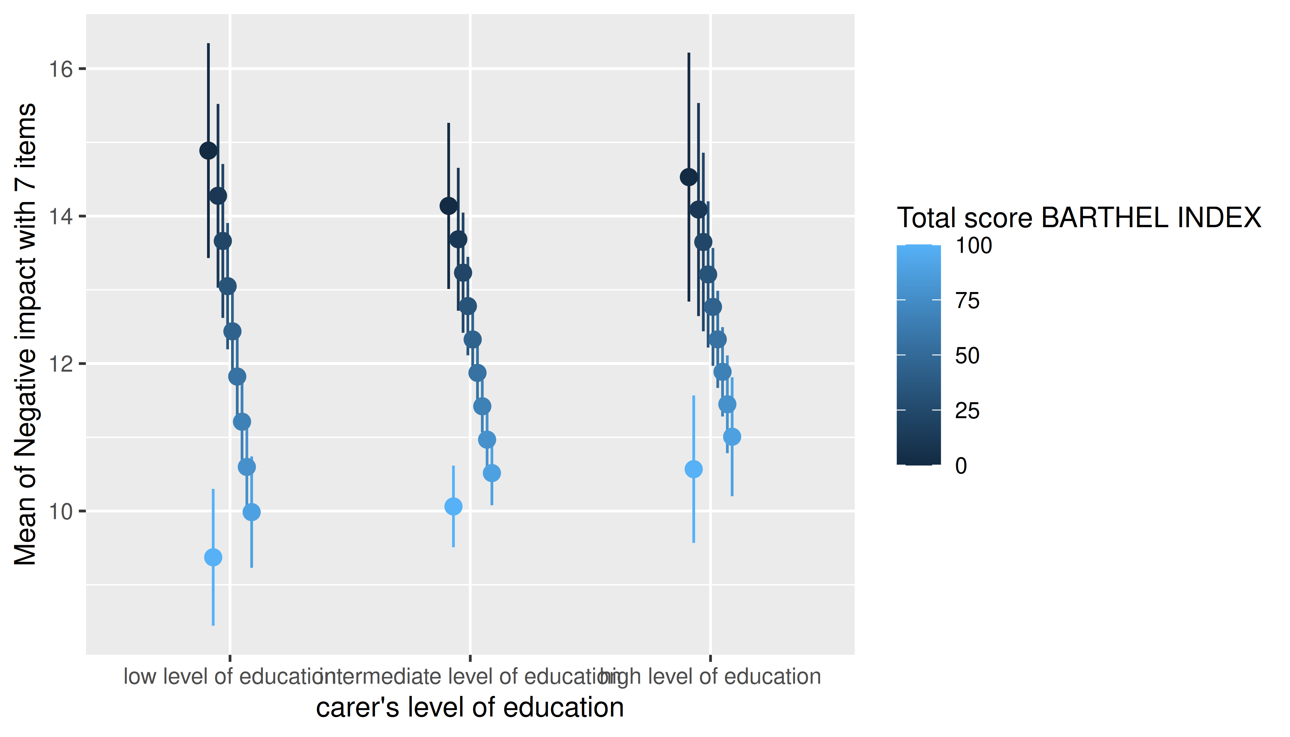
That means that the length argument can be used to
control how many values (lines) for the numeric predictors are
chosen.
estimate_means(m, c("c172code", "barthtot"), length = 20) |> plot()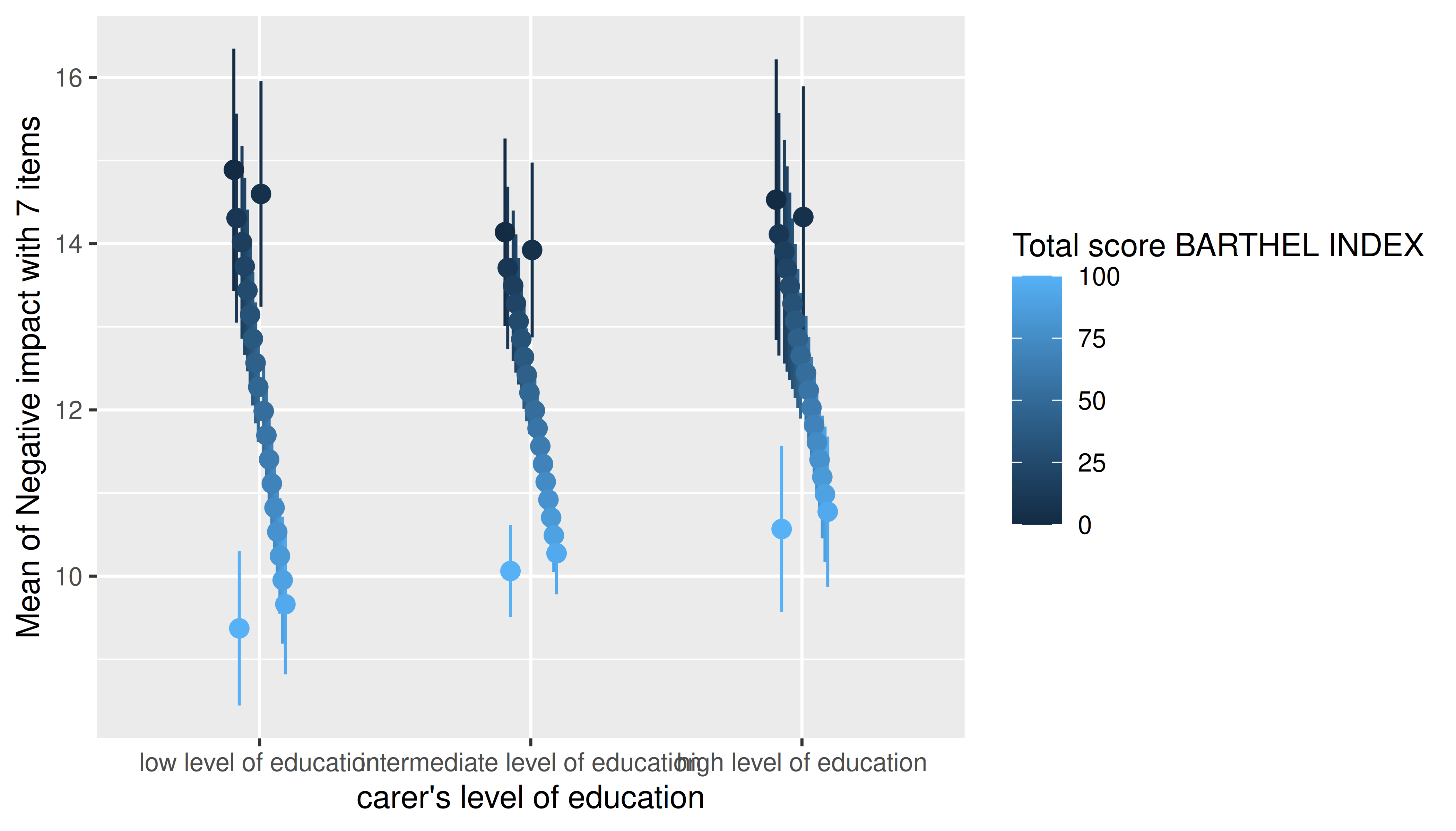
Another option would be to use range = "grid", in which
case the mean and +/- one standard deviation around the mean are chosen
as representative values for numeric predictors.
estimate_means(m, c("c172code", "barthtot"), range = "grid") |> plot()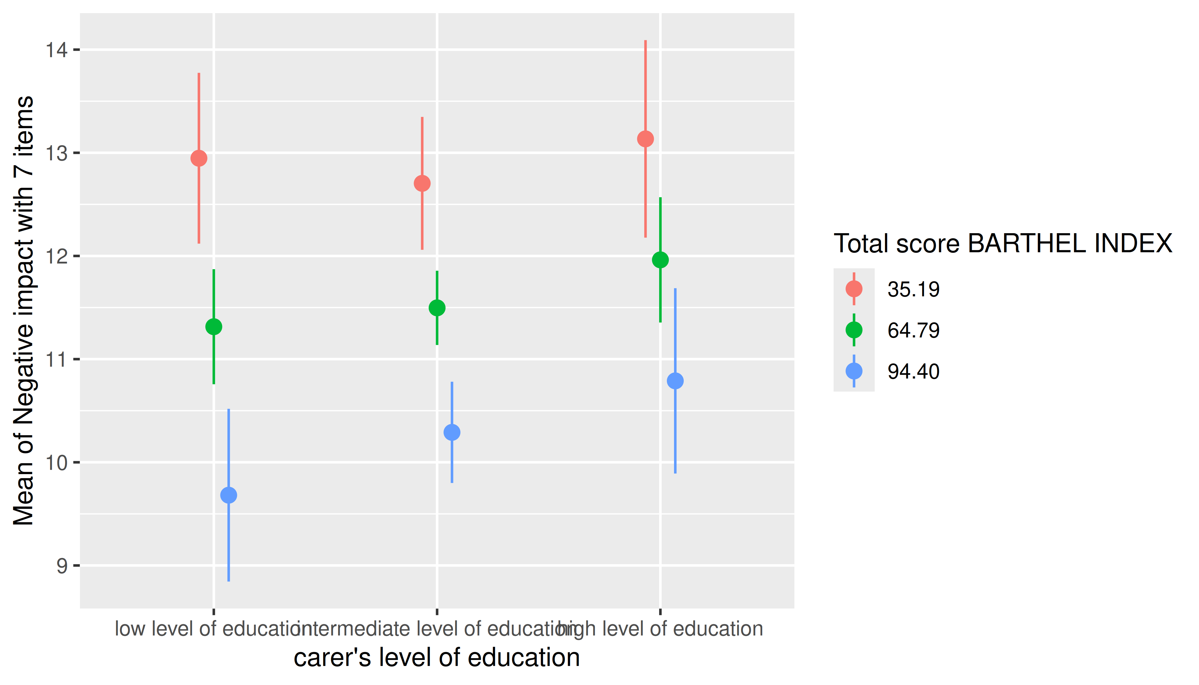
It is also possible to specify representative values, at which the
estimated marginal means of the outcome should be plotted. Again,
consult the documentation at ?ìnsight::get_datagrid for
further details.
estimate_means(
  m,
  c(
    "c172code = c('low level of education', 'high level of education')",
    "barthtot = c(30, 50, 80)"
  )
) |> plot()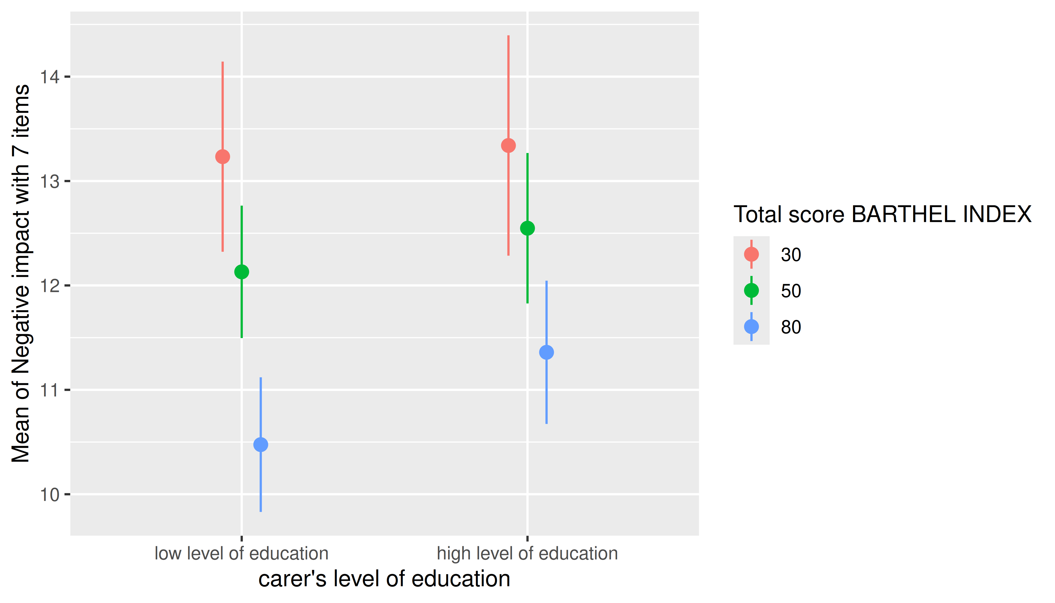
estimate_means(m, c("c172code", "barthtot = [fivenum]")) |> plot()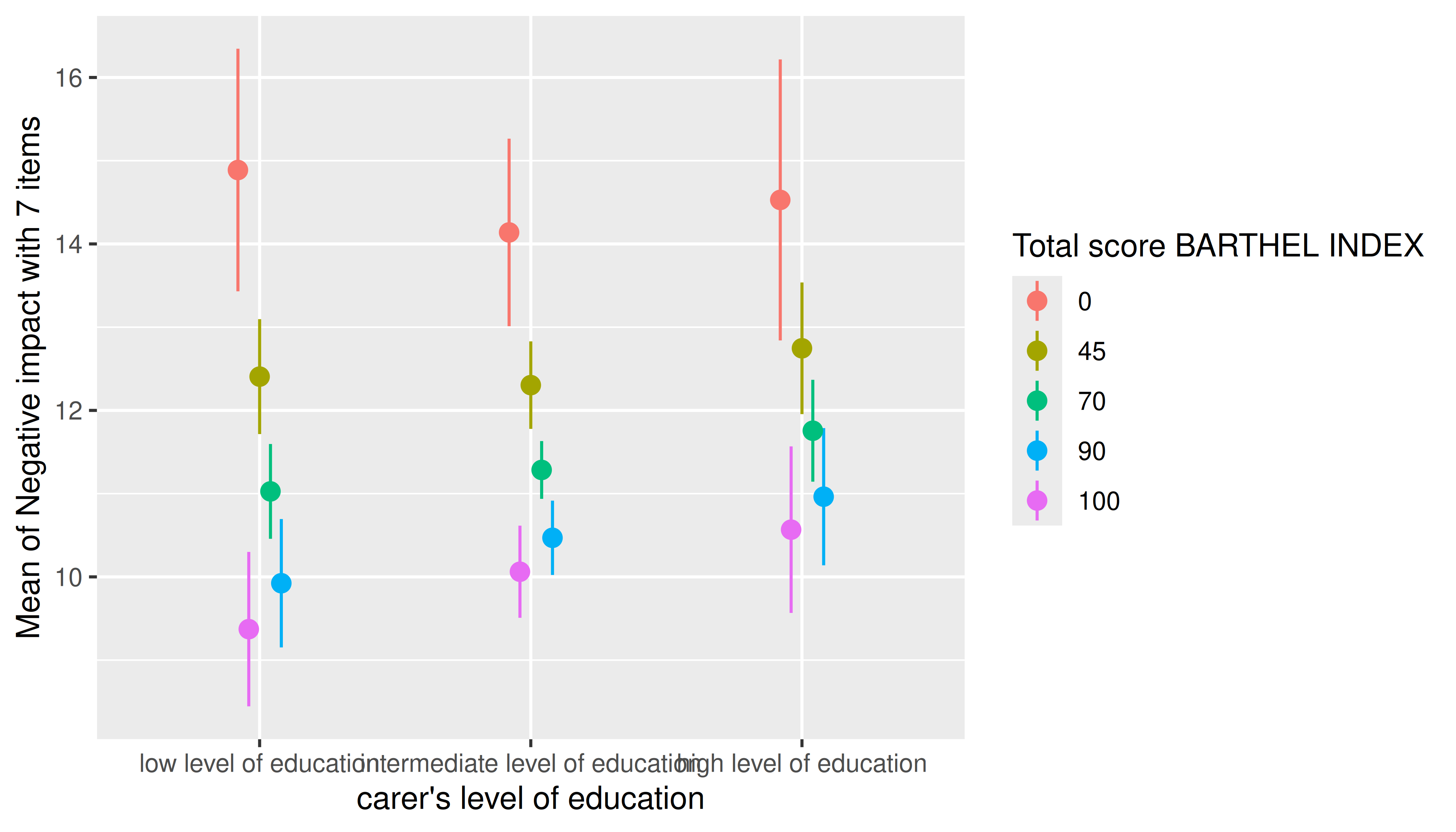
Three numeric predictors
The default plot-setting for three numeric predictors can be rather confusing.
m <- lm(neg_c_7 ~ c12hour * barthtot * c160age, data = efc)
estimate_means(m, c("c12hour", "barthtot", "c160age")) |> plot()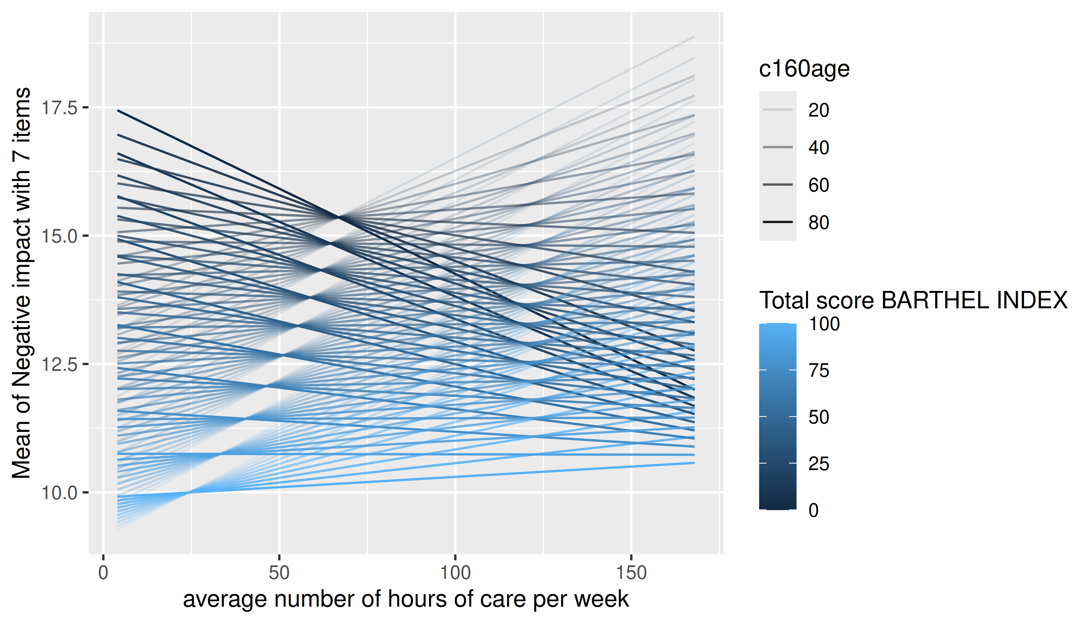
Instead, it is recommended to use length, create a
“reference grid”, or again specify meaningful values directly in the
by argument.
estimate_means(m, c("c12hour", "barthtot", "c160age"), length = 2) |> plot()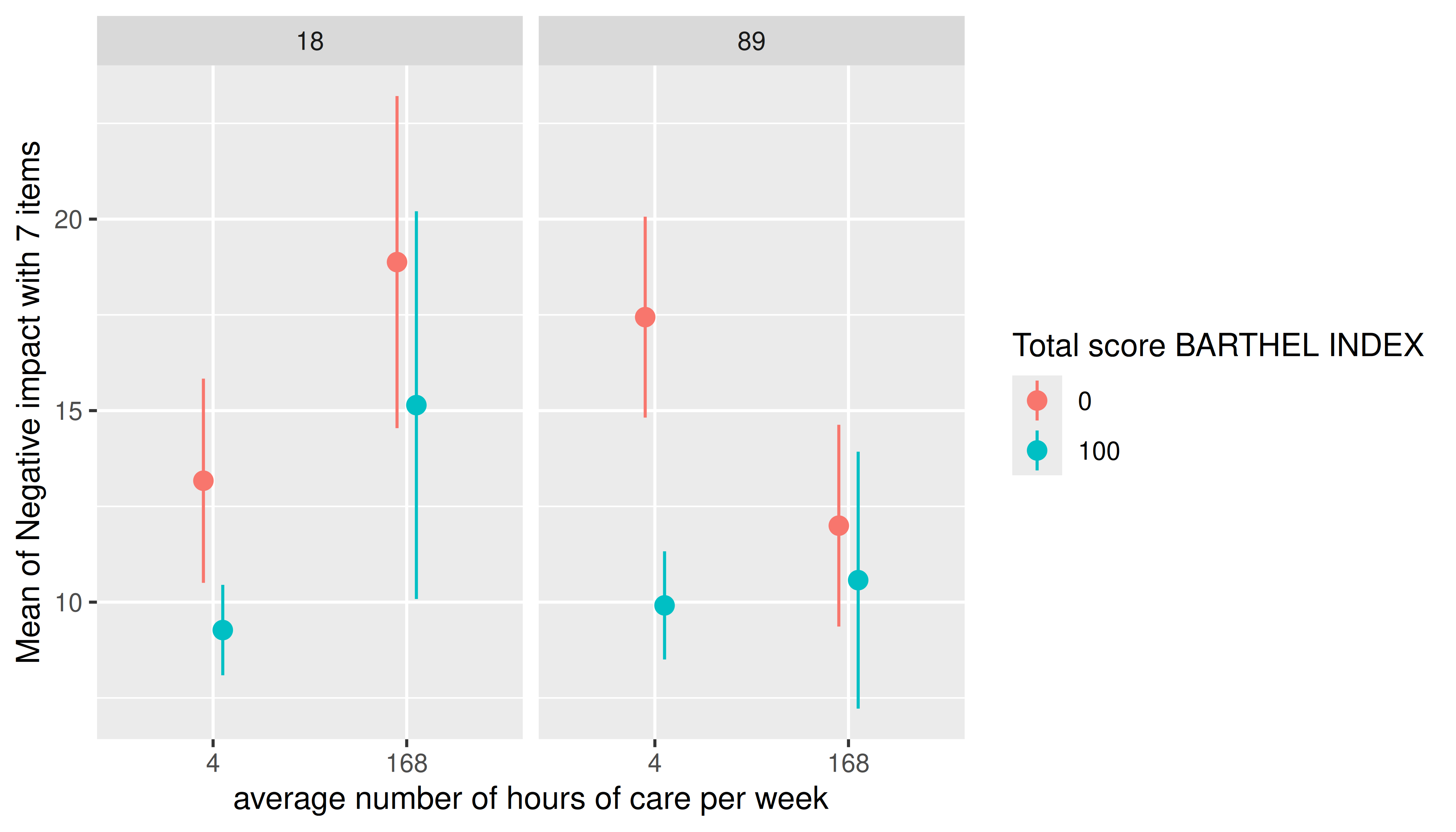
estimate_means(m, c("c12hour", "barthtot", "c160age"), range = "grid") |> plot()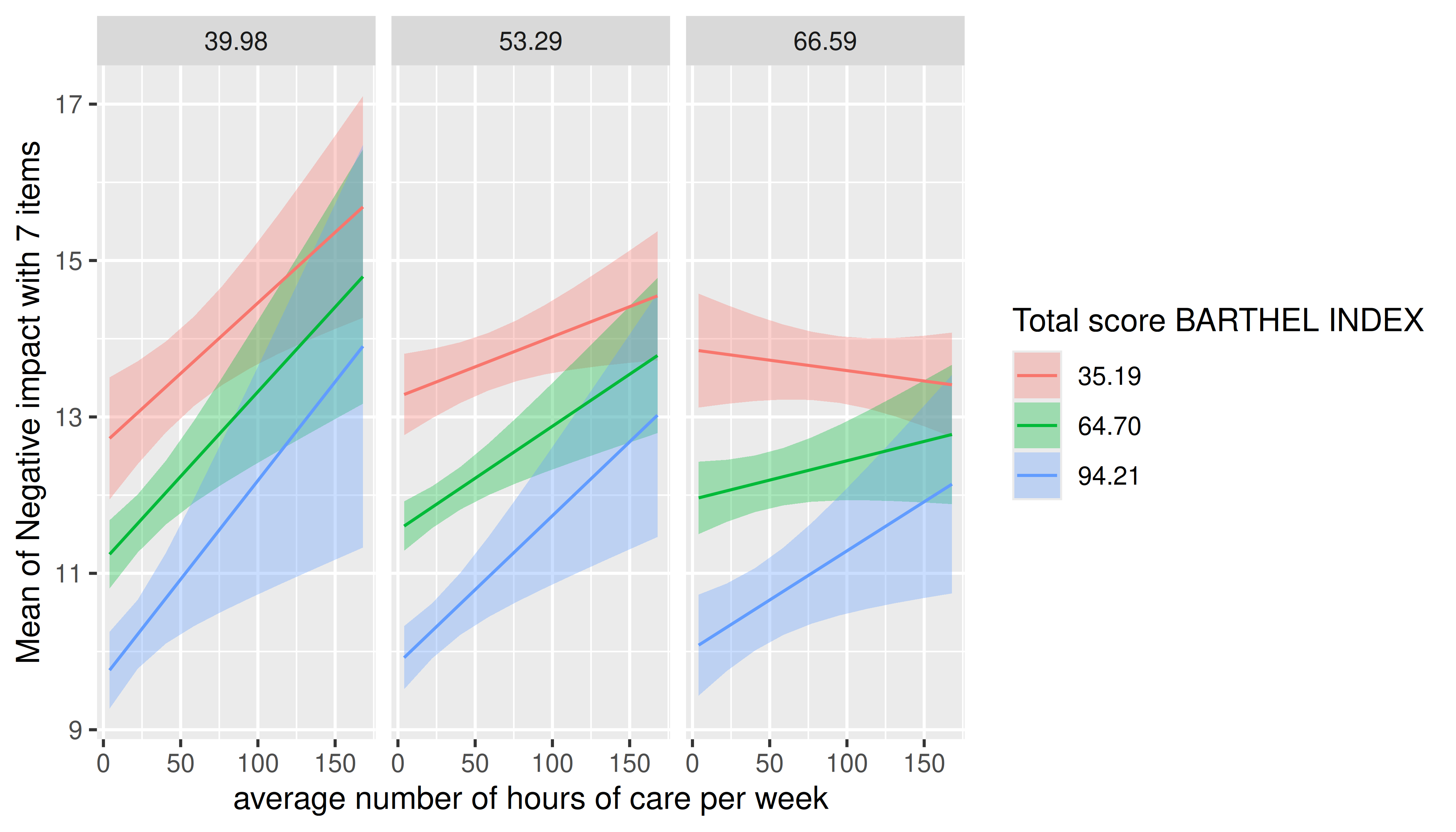
Three categorical predictors
Multiple categorical predictors are usually less problematic, since discrete color scales and faceting are used to distinguish between factor levels.
m <- lm(neg_c_7 ~ e16sex * c172code * e42dep, data = efc)
estimate_means(m, c("e16sex", "c172code", "e42dep")) |> plot()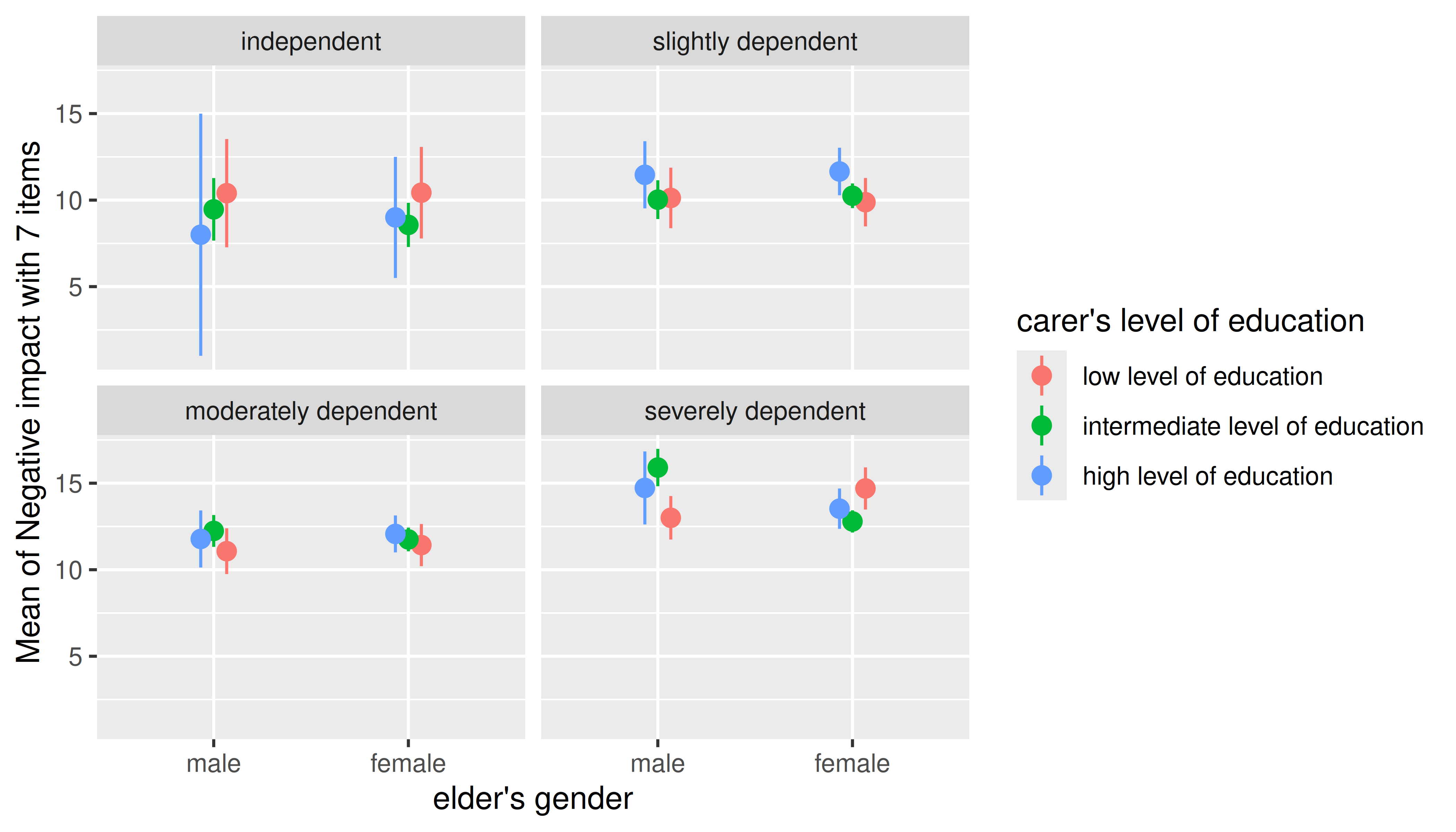
Smooth plots
Remember that by default a range of ten values is chosen for numeric focal predictors. While this mostly works well for plotting linear relationships, plots may look less smooth for certain models that involve quadratic or cubic terms, or splines, or for instance if you have GAMs.
m <- lm(neg_c_7 ~ e16sex * c12hour + e16sex * I(c12hour^2), data = efc)
estimate_means(m, c("c12hour", "e16sex")) |> plot()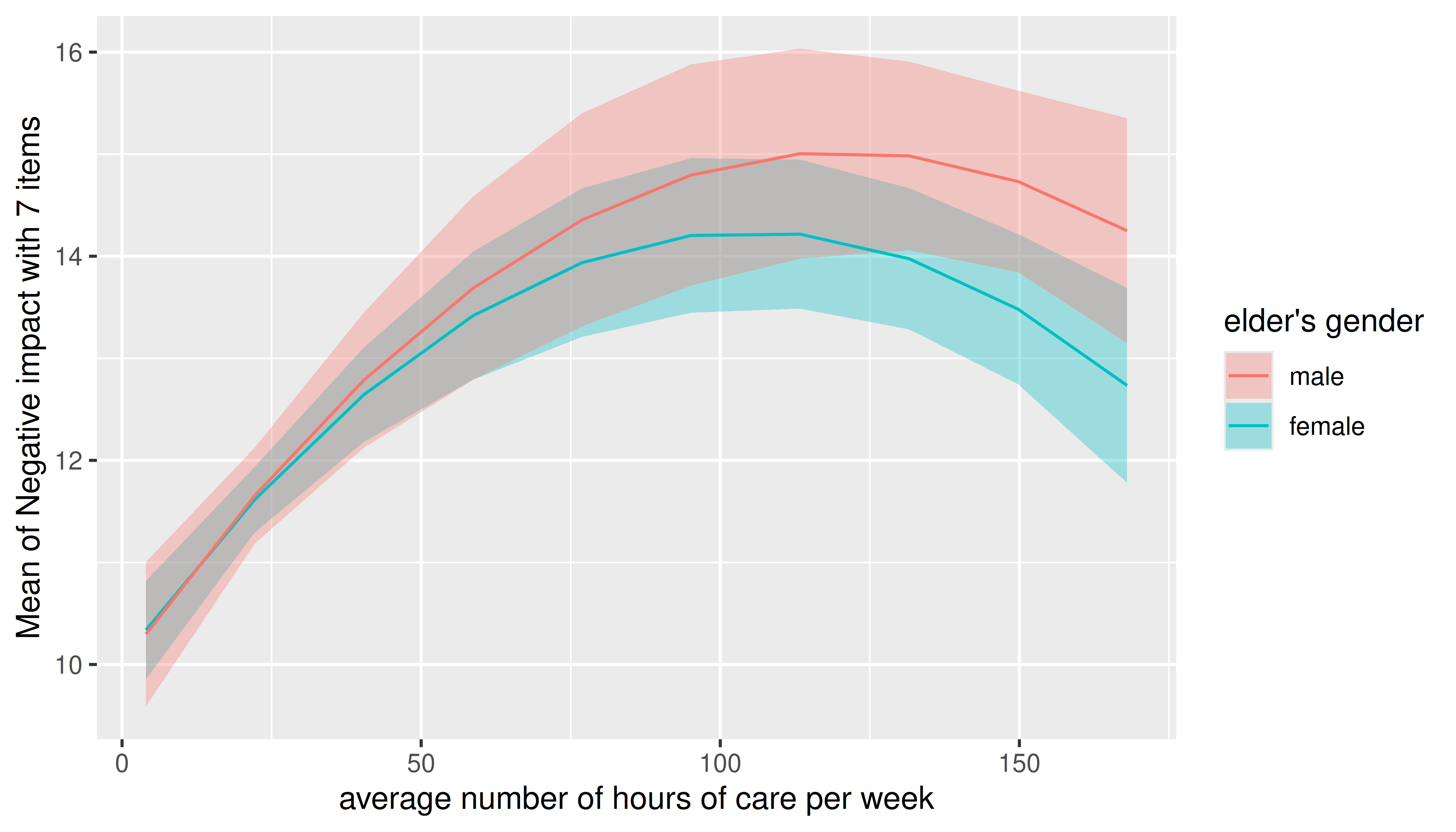
In this case, simply increase the number of representative values by
setting length to a higher number.
estimate_means(m, c("c12hour", "e16sex"), length = 200) |> plot()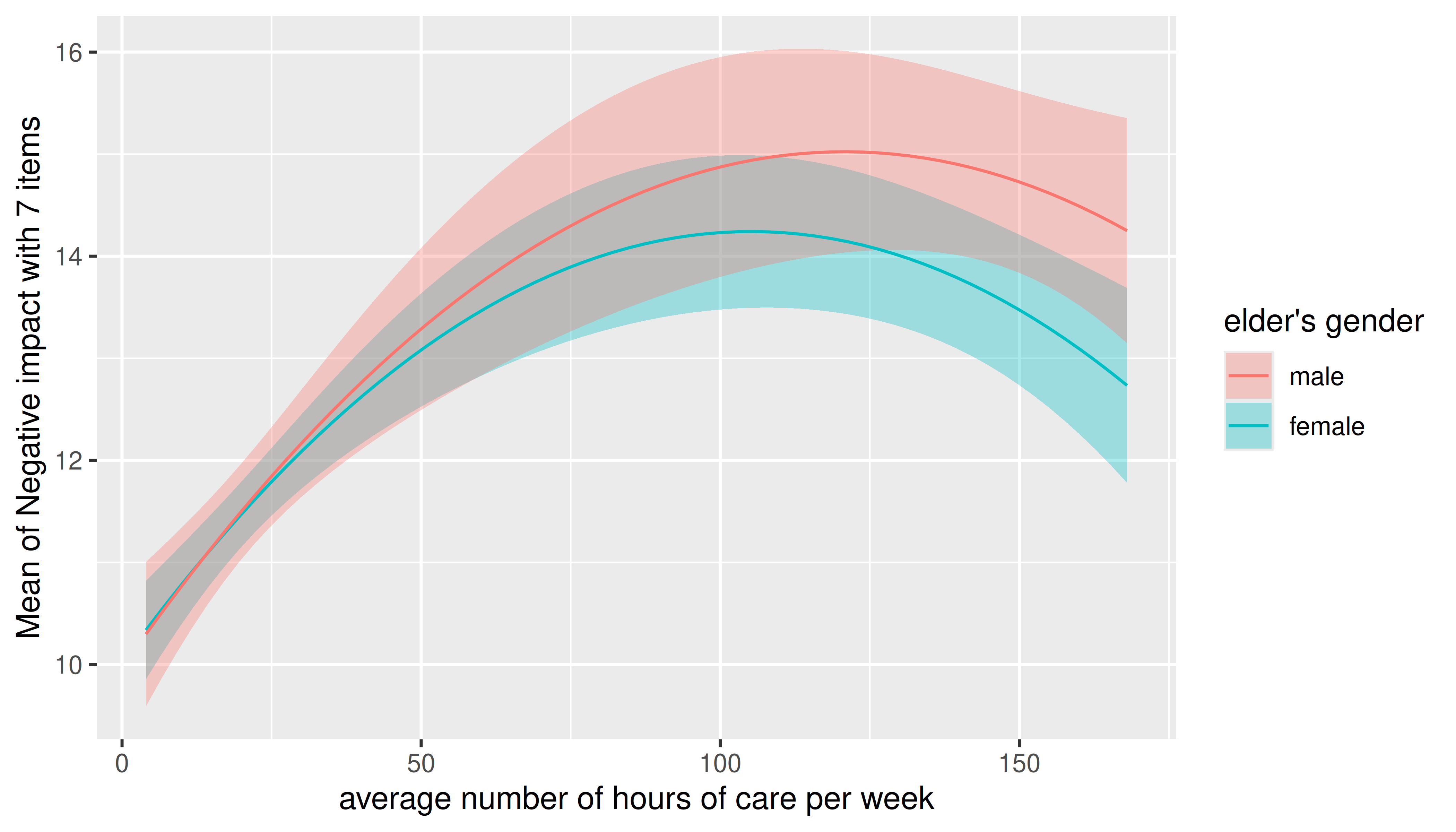
Adding raw data points or partial residuals to the plot
It is possible to add a layer with the original data points to the
plot using show_data = TRUE.
set.seed(1234)
x <- rnorm(200)
z <- rnorm(200)
# quadratic relationship
y <- 2 * x + x^2 + 4 * z + rnorm(200)

d <- data.frame(x, y, z)
m <- lm(y ~ x + z, data = d)
pr <- estimate_means(m, "x")

plot(pr, show_data = TRUE)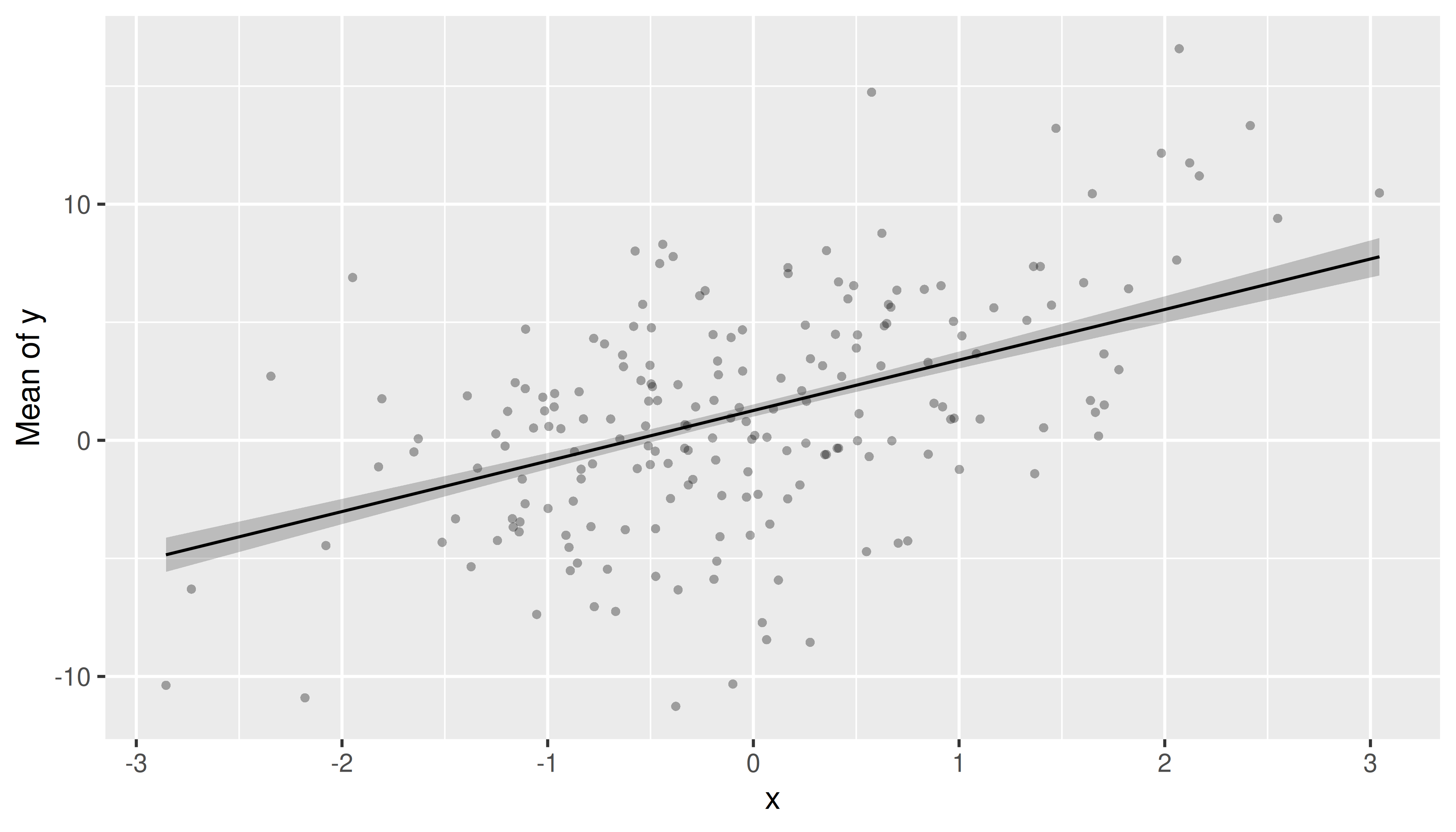
Plotting partial residuals on top of the estimated marginal means allows detecting missed modeling, like unmodelled non-linear relationships or unmodelled interactions. In a nutshell, it allows Visualizing Fit and Lack of Fit in Complex Regression Models with Predictor Effect Plots and Partial Residuals (Fox & Weisberg 2018).
To add partial residuals to a plot, add
show_residuals = TRUE to the plot() function
call. Unlike plotting raw data, partial residuals are much better in
detecting spurious patterns of relationships between predictors and
outcome. In the above example, we have a non-linear relationship. The
missed pattern is not obvious when looking at the raw data, however, it
becomes more apparent when plotting the partial residuals.
plot(pr, show_residuals = TRUE)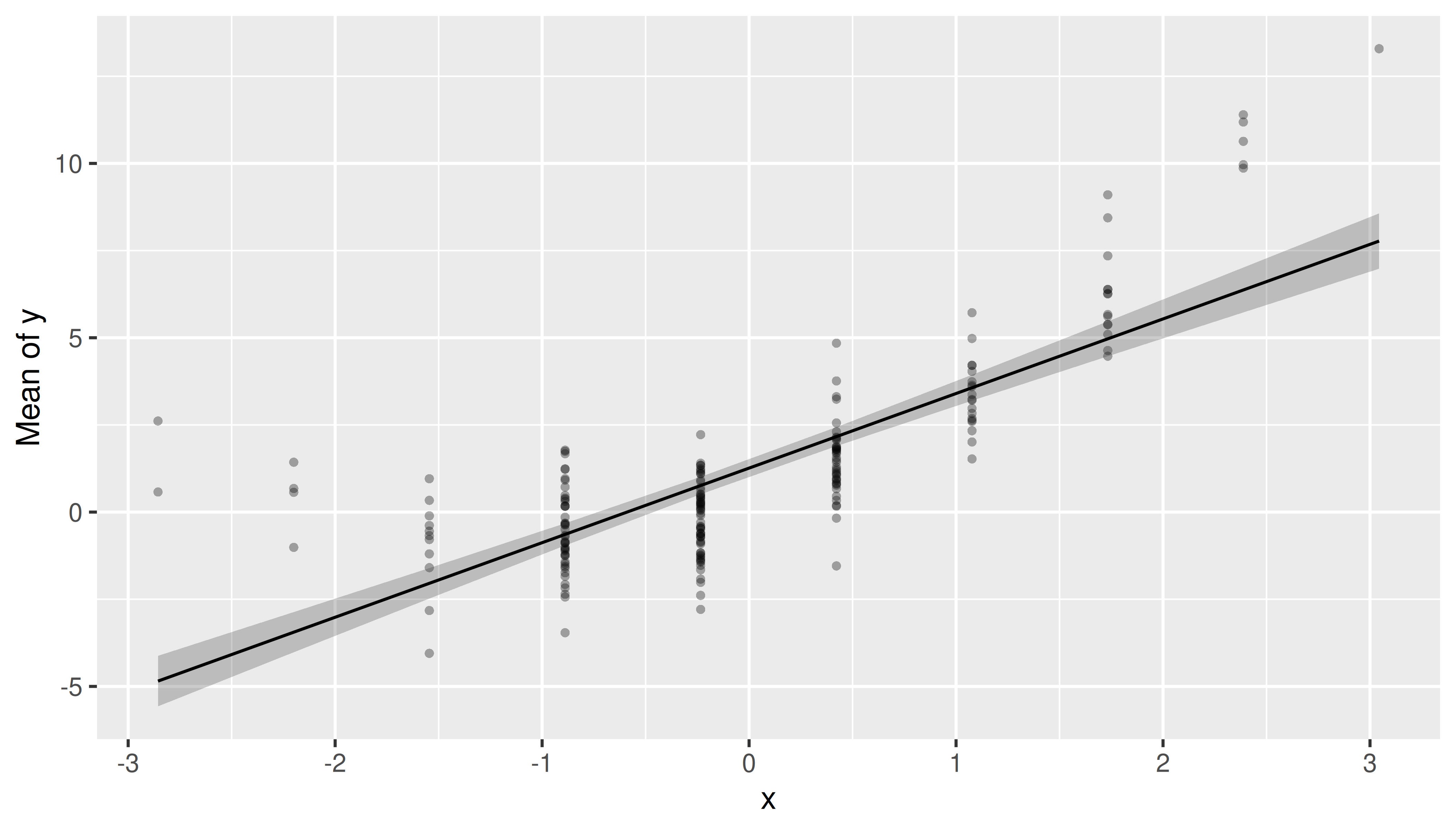
Data points will also be colored by groups automatically.
m <- lm(neg_c_7 ~ e16sex * c172code, data = efc)
emm <- estimate_means(m, c("e16sex", "c172code"))
plot(
  emm,
  show_data = TRUE, # show data points
  point = list(size = 2) # adjust point geoms, increase size
) + facet_wrap(~c172code) # facet panels (group by category)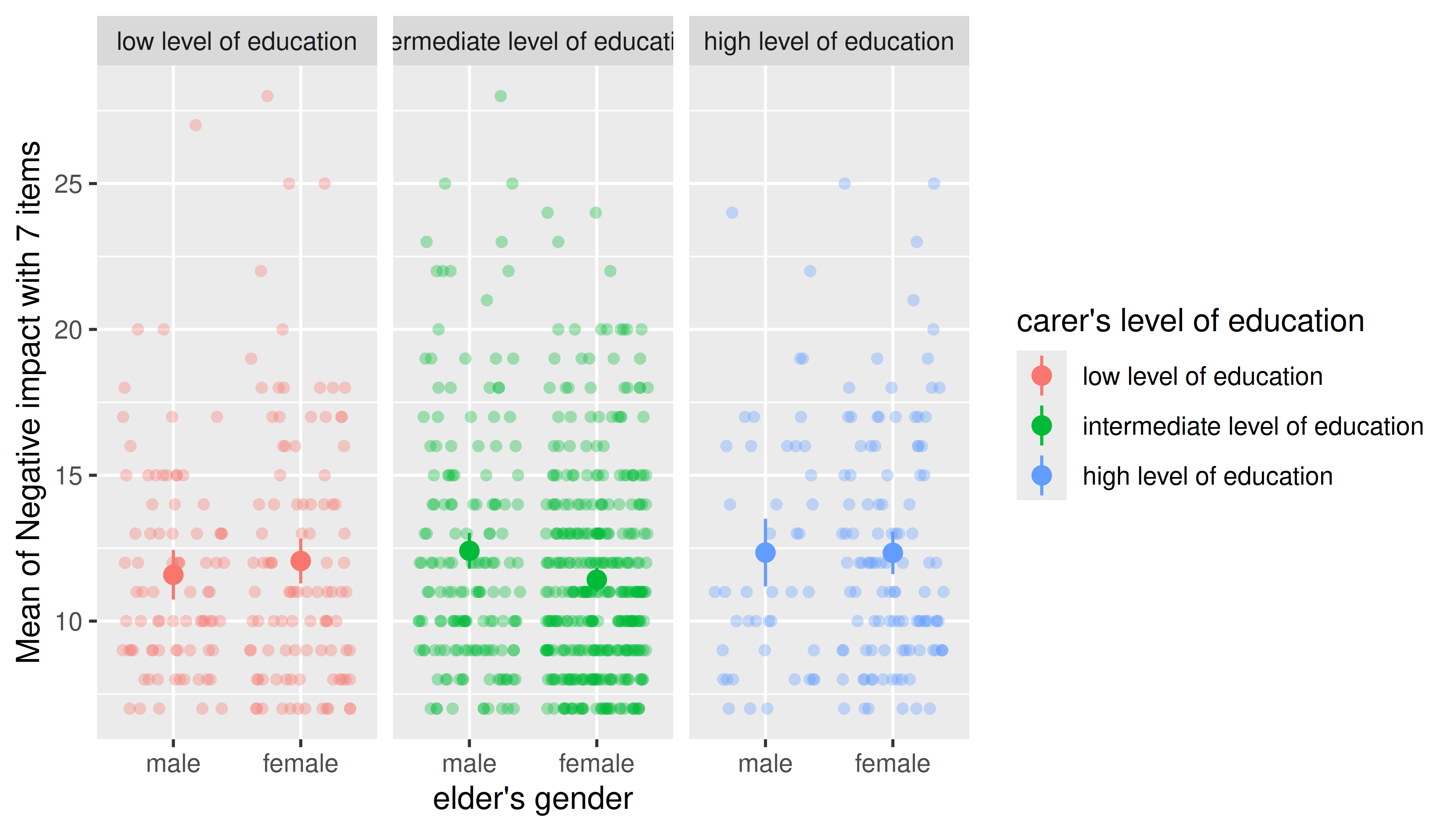
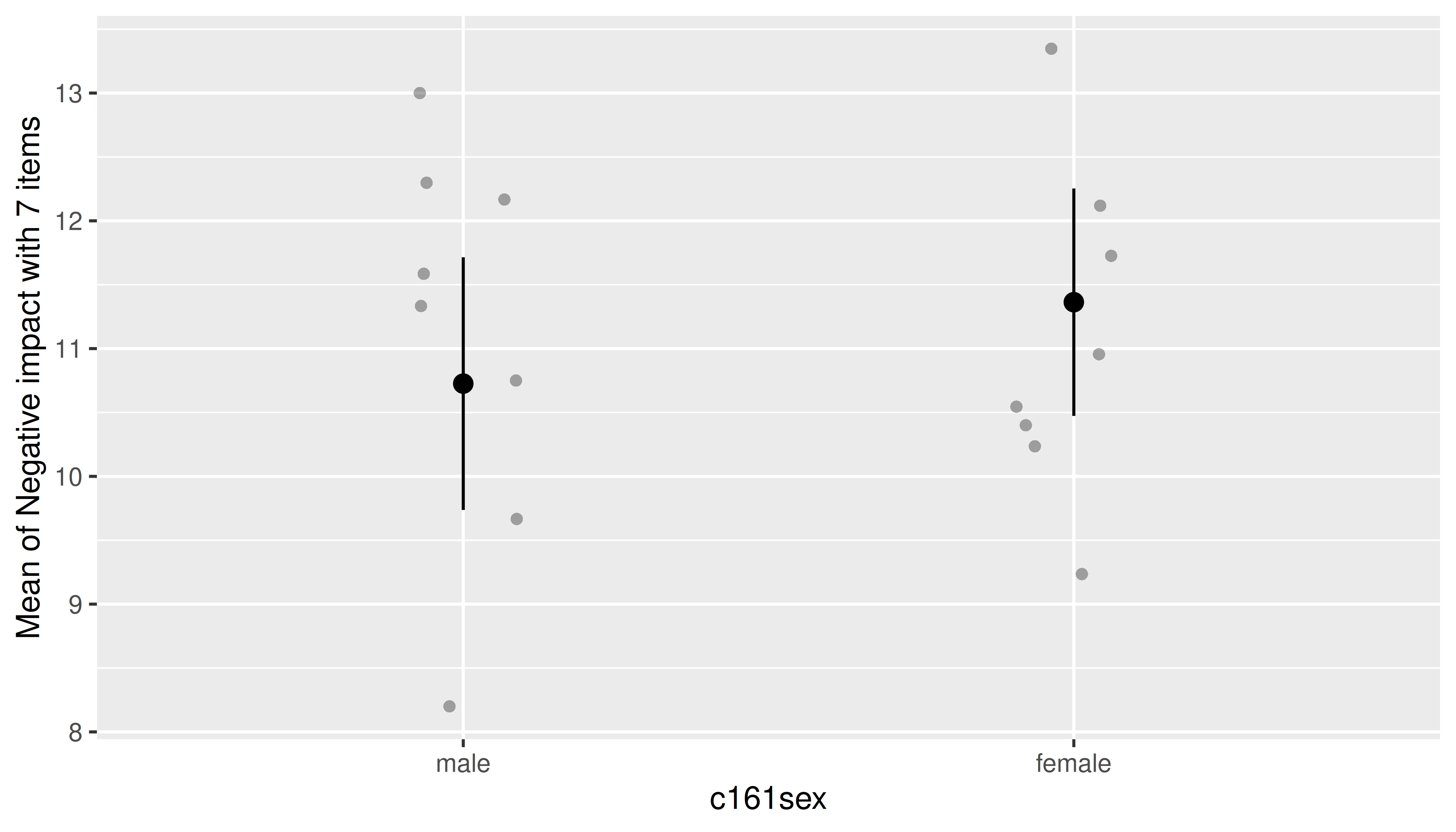
For mixed models, data points can be “collapsed” (i.e. averaged over) grouping variables from the random effects. First, we show an example that includes all data points.
library(lme4)

data(efc)
efc$e15relat <- as.factor(efc$e15relat)
efc$c161sex <- as.factor(efc$c161sex)
levels(efc$c161sex) <- c("male", "female")
model <- lmer(neg_c_7 ~ c161sex + (1 | e15relat), data = efc)

me <- estimate_means(model, "c161sex")
plot(me, show_data = TRUE)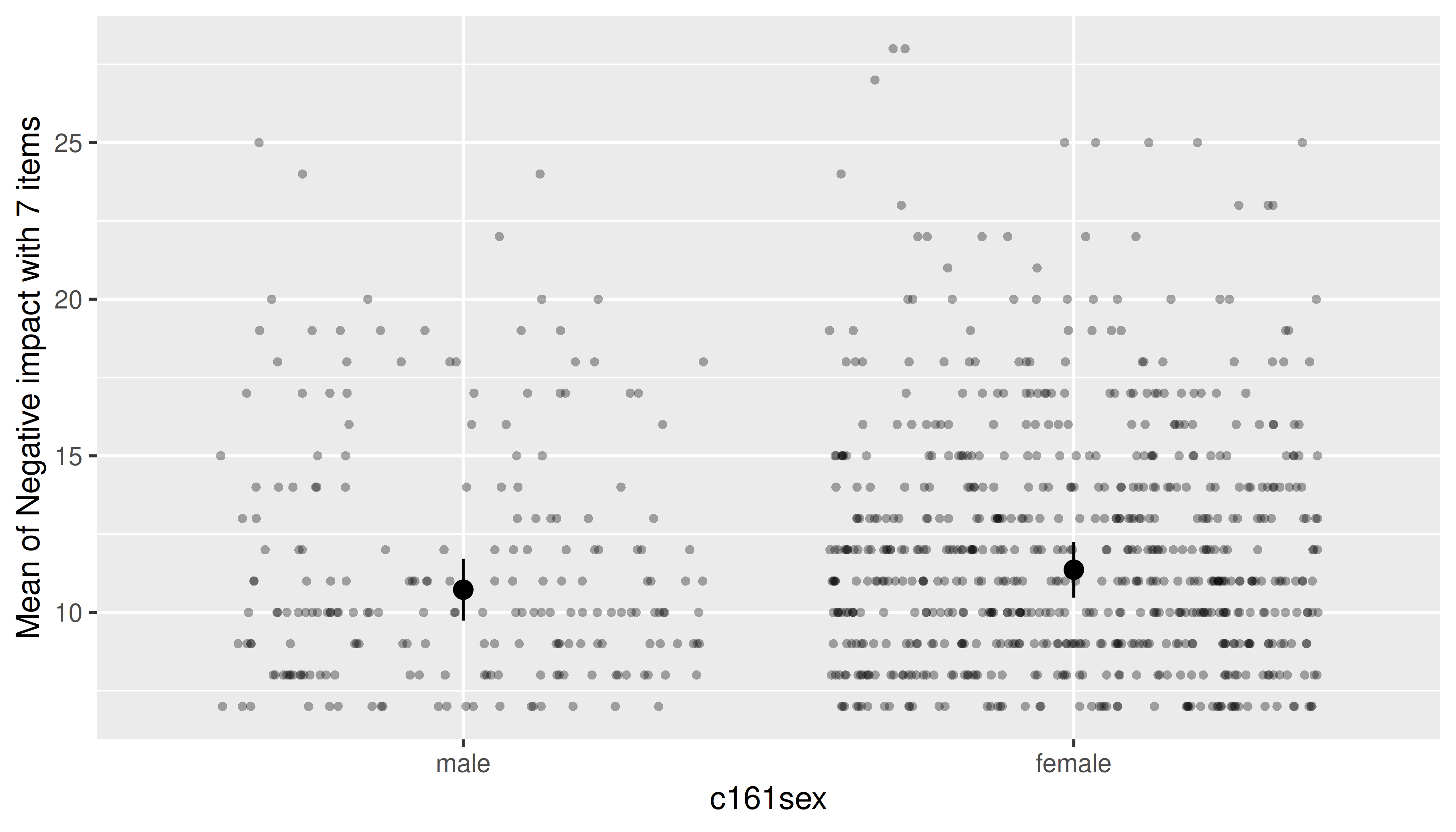
Next, we specify the collapse_group argument, to tell
the plot() function to “average” data points over the
random effects groups, represented by the e15relat
variable.
plot(me, show_data = TRUE, collapse_group = "e15relat")