Visualisation Recipe for 'correlation' Objects
Source:R/visualisation_recipe.cor_test.R, R/visualisation_recipe.easycormatrix.R, R/visualisation_recipe.easycorrelation.R
visualisation_recipe.easycormatrix.RdObjects from the correlation package can be easily visualized. You can
simply run plot() on them, which will internally call the visualisation_recipe()
method to produce a basic ggplot. You can customize this plot ad-hoc or via
the arguments described below.
See examples here.
Usage
# S3 method for class 'easycor_test'
visualisation_recipe(
  x,
  show_data = "point",
  show_text = "subtitle",
  smooth = NULL,
  point = NULL,
  text = NULL,
  labs = NULL,
  ...
)

# S3 method for class 'easycormatrix'
visualisation_recipe(
  x,
  show_data = "tile",
  show_text = "text",
  show_legend = TRUE,
  tile = NULL,
  point = NULL,
  text = NULL,
  scale = NULL,
  scale_fill = NULL,
  labs = NULL,
  type = show_data,
  ...
)

# S3 method for class 'easycorrelation'
visualisation_recipe(x, ...)
Arguments
- x
A correlation object.
- show_data
Show data. For correlation matrices, can be
"tile"(default) or"point".- show_text
Show labels with matrix values.
- ...
Other arguments passed to other functions.
- show_legend
Show legend. Can be set to
FALSEto remove the legend.- tile, point, text, scale, scale_fill, smooth, labs
Additional aesthetics and parameters for the geoms (see customization example).
- type
Alias for
show_data, for backwards compatibility.
Examples
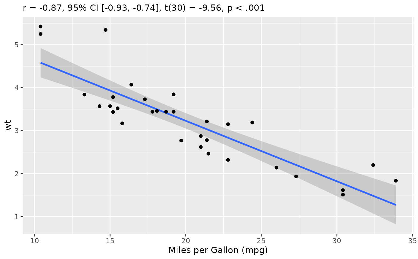
# \donttest{
rez <- cor_test(mtcars, "mpg", "wt")
layers <- visualisation_recipe(rez, labs = list(x = "Miles per Gallon (mpg)"))
layers
#> Layer 1
#> --------
#> Geom type: smooth
#> data = [32 x 11]
#> method = 'lm'
#> aes_string(
#> x = 'mpg'
#> y = 'wt'
#> )
#>
#> Layer 2
#> --------
#> Geom type: point
#> data = [32 x 11]
#> aes_string(
#> x = 'mpg'
#> y = 'wt'
#> )
#>
#> Layer 3
#> --------
#> Geom type: labs
#> subtitle = 'r = -0.87, 95% CI [-0.93, -0.74], t(30) = -9.56, p < .001'
#> x = 'Miles per Gallon (mpg)'
#>
plot(layers)
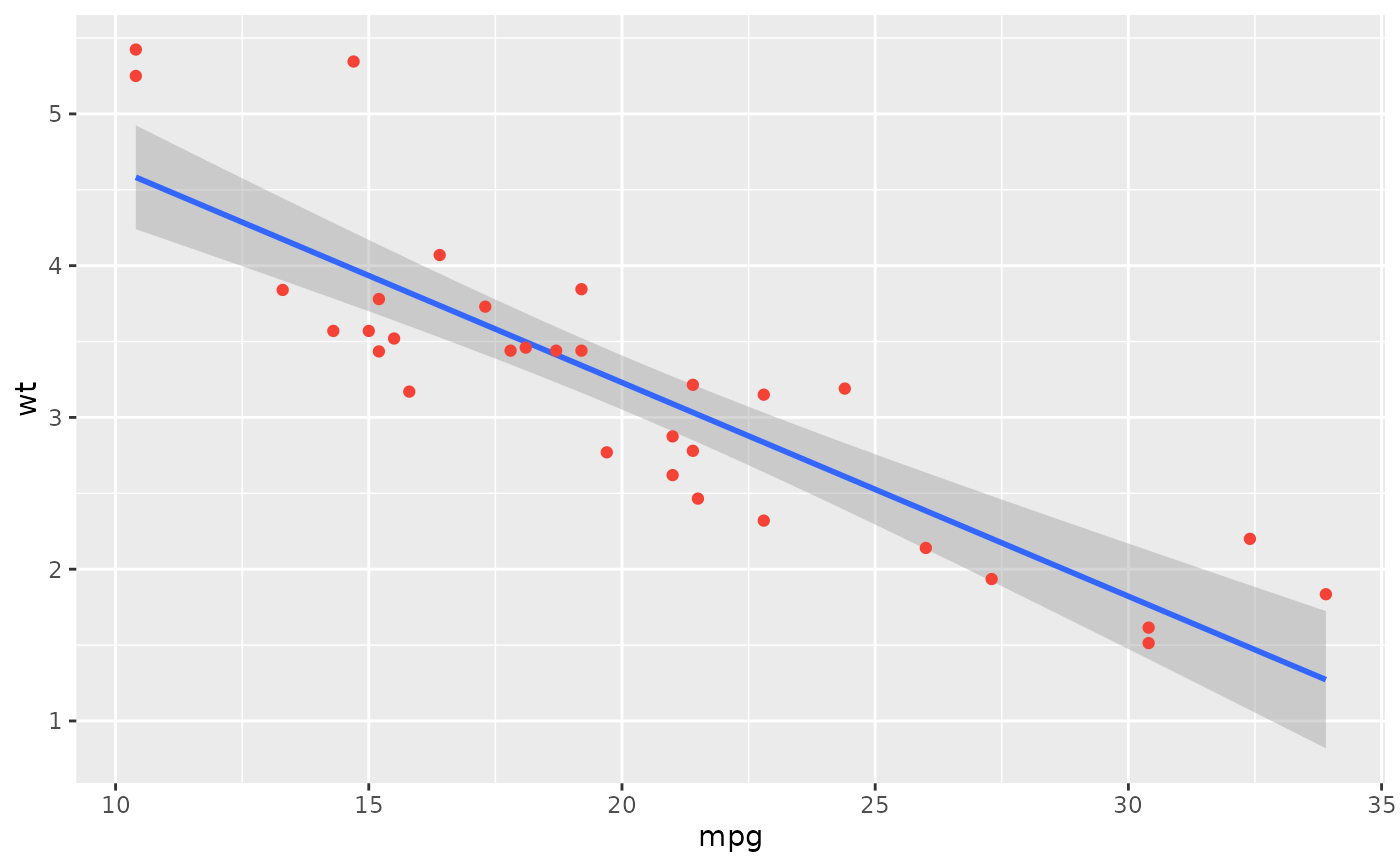
 plot(rez,
show_text = "label",
point = list(color = "#f44336"),
text = list(fontface = "bold"),
show_statistic = FALSE, show_ci = FALSE, stars = TRUE
)
plot(rez,
show_text = "label",
point = list(color = "#f44336"),
text = list(fontface = "bold"),
show_statistic = FALSE, show_ci = FALSE, stars = TRUE
)
 # }
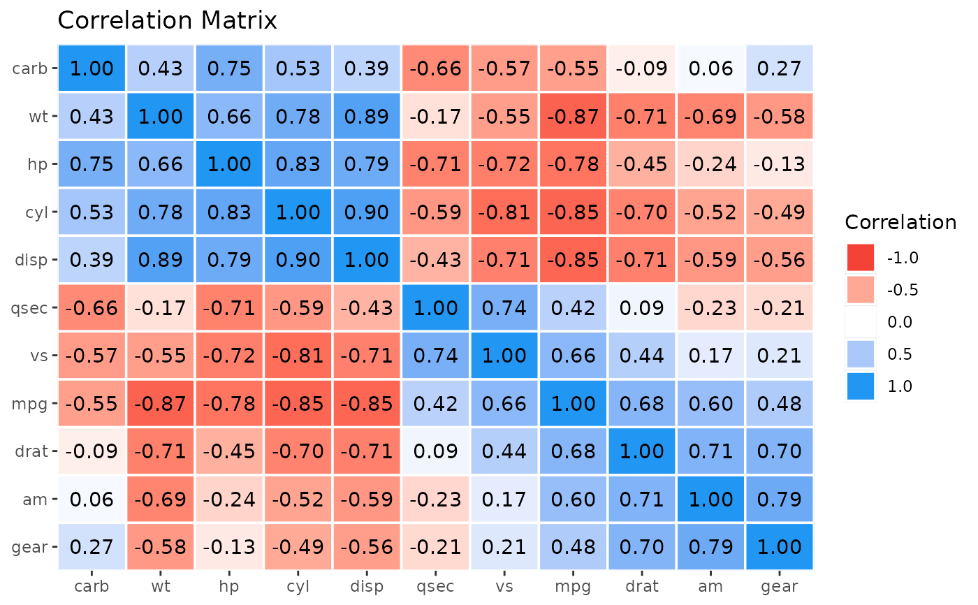
# \donttest{
rez <- correlation(mtcars)
x <- cor_sort(as.matrix(rez))
layers <- visualisation_recipe(x)
layers
#> Layer 1
#> --------
#> Geom type: tile
#> data = [121 x 5]
#> aes_string(
#> y = 'Parameter1'
#> x = 'Parameter2'
#> fill = 'r'
#> )
#> color = 'white'
#> size = 0.6
#>
#> Layer 2
#> --------
#> Geom type: text
#> data = [121 x 5]
#> aes_string(
#> y = 'Parameter1'
#> x = 'Parameter2'
#> label = 'Text'
#> )
#>
#> Layer 3
#> --------
#> Geom type: scale_fill_gradient2
#> low = '#F44336'
#> mid = 'white'
#> high = '#2196F3'
#> midpoint = 0
#> na.value = 'grey85'
#> limit = c(-1, 1)
#> space = 'Lab'
#> name = 'Correlation'
#> guide = 'legend'
#>
#> Layer 4
#> --------
#> Geom type: scale_x_discrete
#> expand = c(0, 0)
#>
#> Layer 5
#> --------
#> Geom type: scale_y_discrete
#> expand = c(0, 0)
#>
#> Layer 6
#> --------
#> Geom type: labs
#> title = 'Correlation Matrix'
#>
plot(layers)
# }
# \donttest{
rez <- correlation(mtcars)
x <- cor_sort(as.matrix(rez))
layers <- visualisation_recipe(x)
layers
#> Layer 1
#> --------
#> Geom type: tile
#> data = [121 x 5]
#> aes_string(
#> y = 'Parameter1'
#> x = 'Parameter2'
#> fill = 'r'
#> )
#> color = 'white'
#> size = 0.6
#>
#> Layer 2
#> --------
#> Geom type: text
#> data = [121 x 5]
#> aes_string(
#> y = 'Parameter1'
#> x = 'Parameter2'
#> label = 'Text'
#> )
#>
#> Layer 3
#> --------
#> Geom type: scale_fill_gradient2
#> low = '#F44336'
#> mid = 'white'
#> high = '#2196F3'
#> midpoint = 0
#> na.value = 'grey85'
#> limit = c(-1, 1)
#> space = 'Lab'
#> name = 'Correlation'
#> guide = 'legend'
#>
#> Layer 4
#> --------
#> Geom type: scale_x_discrete
#> expand = c(0, 0)
#>
#> Layer 5
#> --------
#> Geom type: scale_y_discrete
#> expand = c(0, 0)
#>
#> Layer 6
#> --------
#> Geom type: labs
#> title = 'Correlation Matrix'
#>
plot(layers)
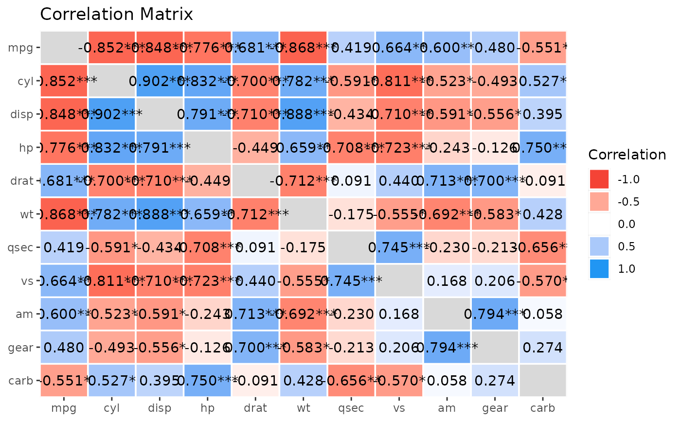
 #' Get more details using `summary()`
x <- summary(rez, redundant = TRUE, digits = 3)
plot(visualisation_recipe(x))
#' Get more details using `summary()`
x <- summary(rez, redundant = TRUE, digits = 3)
plot(visualisation_recipe(x))
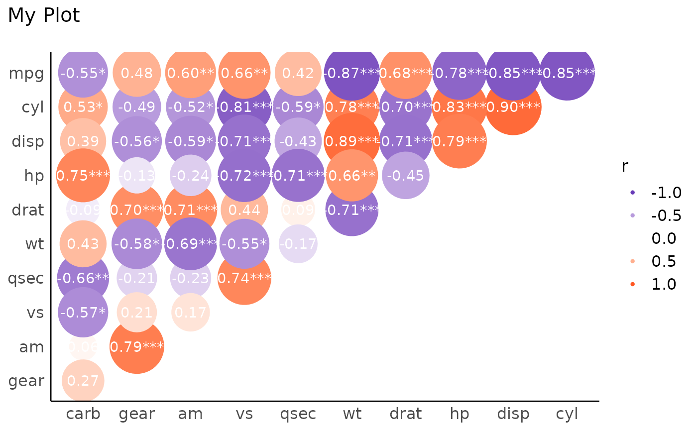
 # Customize
x <- summary(rez)
layers <- visualisation_recipe(x,
show_data = "points",
scale = list(range = c(10, 20)),
scale_fill = list(
high = "#FF5722",
low = "#673AB7",
name = "r"
),
text = list(color = "white"),
labs = list(title = "My Plot")
)
plot(layers) + theme_modern()
# Customize
x <- summary(rez)
layers <- visualisation_recipe(x,
show_data = "points",
scale = list(range = c(10, 20)),
scale_fill = list(
high = "#FF5722",
low = "#673AB7",
name = "r"
),
text = list(color = "white"),
labs = list(title = "My Plot")
)
plot(layers) + theme_modern()
 # }
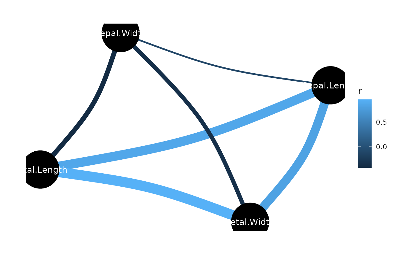
# \donttest{
rez <- correlation(iris)
layers <- visualisation_recipe(rez)
layers
#> Layer 1
#> --------
#> Geom type: ggraph::geom_edge_arc
#> strength = 0.1
#> aes_string(
#> edge_colour = 'r'
#> edge_width = 'width'
#> )
#>
#> Layer 2
#> --------
#> Geom type: ggraph::geom_node_point
#> size = 22
#>
#> Layer 3
#> --------
#> Geom type: ggraph::geom_node_text
#> aes_string(
#> label = 'name'
#> )
#> colour = 'white'
#>
#> Layer 4
#> --------
#> Geom type: ggraph::theme_graph
#> base_family = 'sans'
#>
#> Layer 5
#> --------
#> Geom type: guides
#> edge_width = 'none'
#>
plot(layers)
# }
# \donttest{
rez <- correlation(iris)
layers <- visualisation_recipe(rez)
layers
#> Layer 1
#> --------
#> Geom type: ggraph::geom_edge_arc
#> strength = 0.1
#> aes_string(
#> edge_colour = 'r'
#> edge_width = 'width'
#> )
#>
#> Layer 2
#> --------
#> Geom type: ggraph::geom_node_point
#> size = 22
#>
#> Layer 3
#> --------
#> Geom type: ggraph::geom_node_text
#> aes_string(
#> label = 'name'
#> )
#> colour = 'white'
#>
#> Layer 4
#> --------
#> Geom type: ggraph::theme_graph
#> base_family = 'sans'
#>
#> Layer 5
#> --------
#> Geom type: guides
#> edge_width = 'none'
#>
plot(layers)
 # }
# }